What do you reckon? 🥰🩵
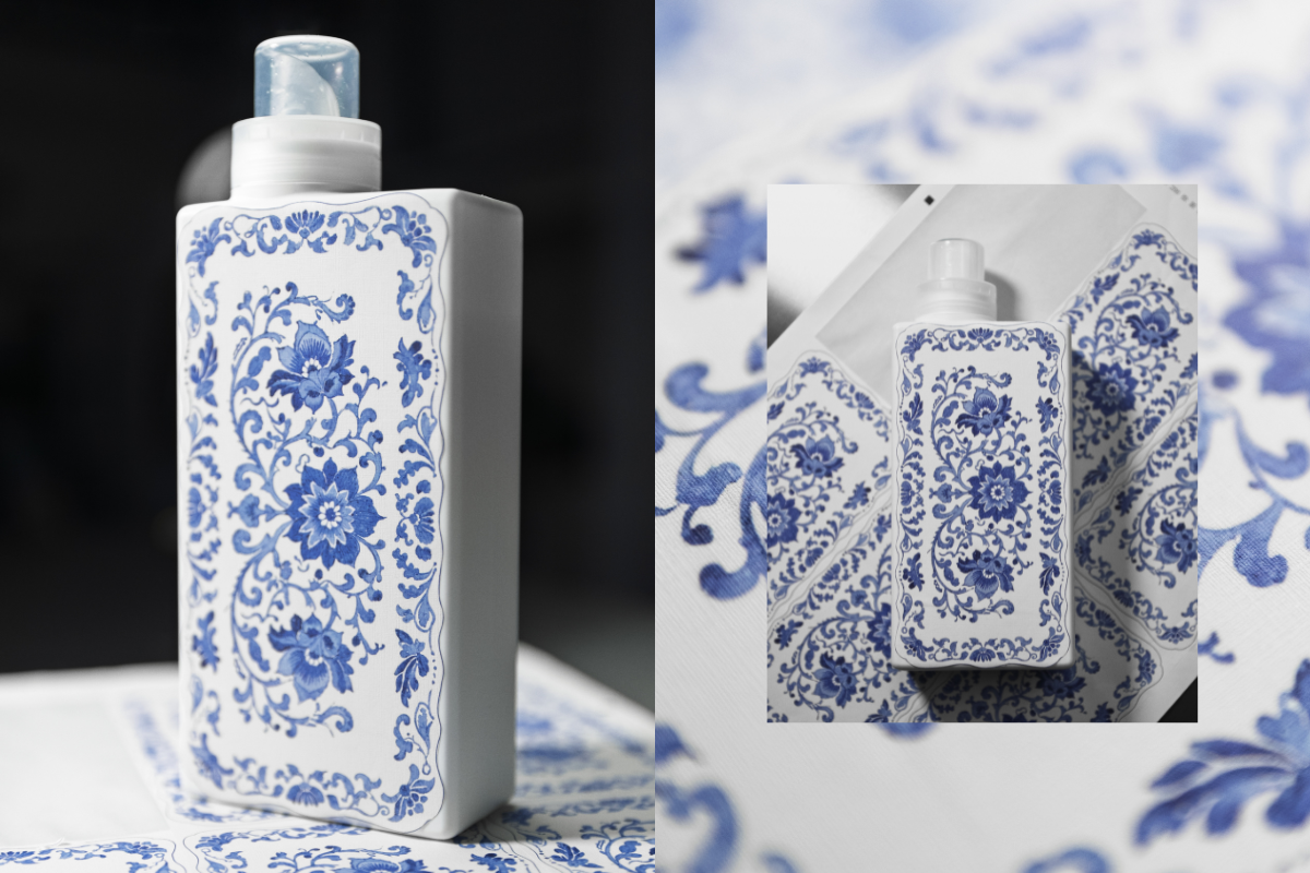
This is our first ever sample of a new print we’re testing as part of exploring beautiful upgraded bottle designs!
We’re thinking about how we can bring amazing patterns and artwork onto our existing bottles - this one is inspired by classic Spode prints and we’re so happy with how it’s turned out! 😍
The texture of the sticker gives a really warm, homely, linen vibe and the print has transferred beautifully onto the material. It’s not the final design as we still need to add all the T+A branding you know and love, but we’d love to know what you think! Would you love to see this, and other artwork on your T+A bottles in 2026? 💙


964 comments
Davetta Guinn
I am excited to see all of the designs.I certainly will be a collector.
Davetta Guinn
I am excited to see all of the designs.I certainly will be a collector.
Kin
Beautiful love it hope that comes in different designs and colours too
Aisling B
It matches the porcelain tiles in my bathroom and my plates 😂❤️ definitely leave a side free so we can write the smell on the side with a chalk pen ❤️ excellent idea so folk can just buy refills :)
Sarah Healey
I would say leave the bottle design as they are,they are aray of beautiful colours when on show & don’t need fancy art work added to them because it’s not everyone’s cup of tea!!!
Customers may love the fragrances but hate the new designs & bottles which don’t fit in with their kitchen/utility room,it’s a huge risk to take,keep the bottles simple & just have occasional bottles covered in art like the Skull design or maybe pumpkin design for Halloween bottles,keep them for special events like Hearts for Valentines bottles,Christmas trees or decorations for the Christmas range but keep all the other bottles simple,elegant,sophisticated which is what stands out for the T&A company….
Leave a comment
This site is protected by hCaptcha and the hCaptcha Privacy Policy and Terms of Service apply.