16 June 2026
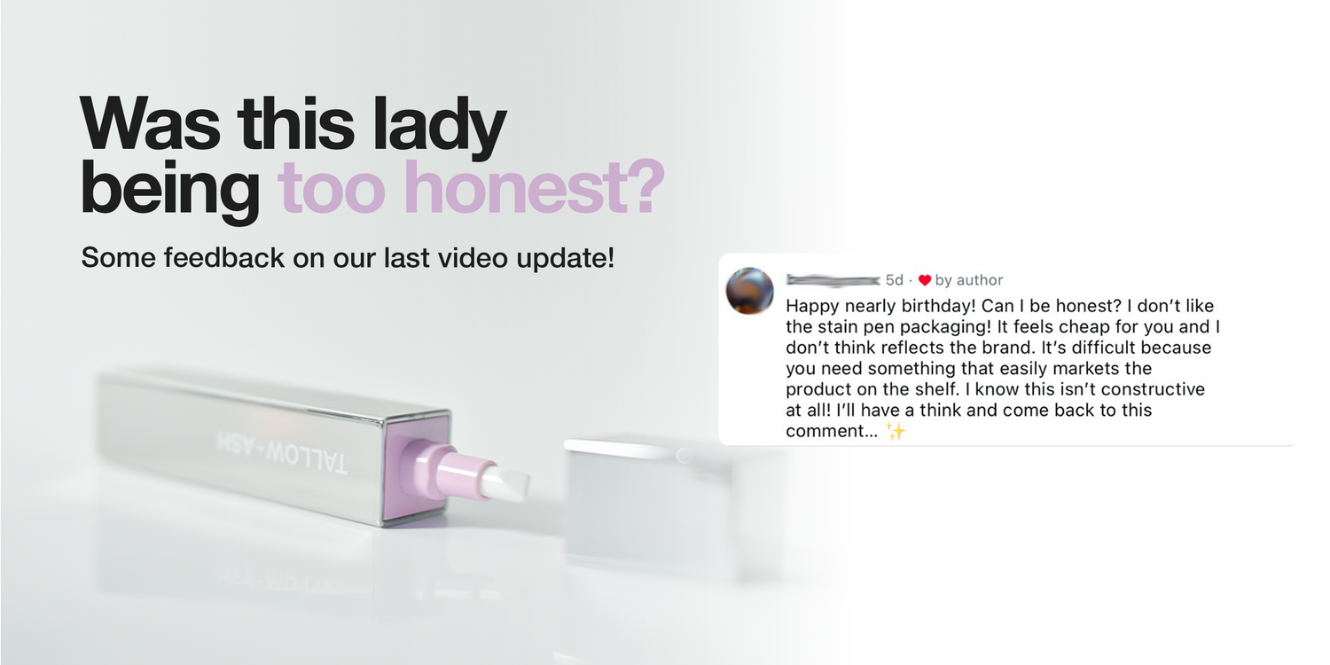
Was this lady being too honest? 🫣🤪😂🫶
We showed our new packaging, thinking it was great, and a customer commented saying that she didn’t like it 😮
But really, that comment was exactly what we needed! Because honestly, we didn’t like it either 😅😂
We are trying to do something different in laundry, to reinvent an entire industry.
And the way that we designed that first packaging was actually to satisfy the way retail is currently done! But it just doesn’t nail what we are trying to do.
So, thank you! 🫶
We are sending you a free stain pen for giving us the push we needed, and we’ve gone back to the drawing board 😂
Here’s a few shots of what we’re working on! I’ve labelled them A, B, and C so let us know which one you prefer, and we’ll make it happen!!


1145 commentaires
Anna Sanders
Love B but love all the info on the side of the Archived concept but not the hand holding the product, this is one of the things that makes it look tacky (sorry to who evers hand it is 🫣). If you could combine the two things that would be good but I don’t think it looks good to have the lovely looking clean cut angles of the box and then pair it with the round corners on the side information piece (as in c). Just looks wrong some how and detracts from the beautiful looking box. Just my thoughts x
Harriet Shaw
B looks abit more classy
Kate Silvester
C looks very smart .
Susana Crosby
I liked A because it’s a more minimalist design. You don’t need the advert on the box.
Paul
A – would be more robust on the shelf as B would easily be torn open. C wouldn’t easily fit on the shelf.
Laisser un commentaire
Ce site est protégé par hCaptcha, et la Politique de confidentialité et les Conditions de service de hCaptcha s’appliquent.