15 avril 2024
Pour participer aux conversations sur le développement, suivez notre page Instagram !
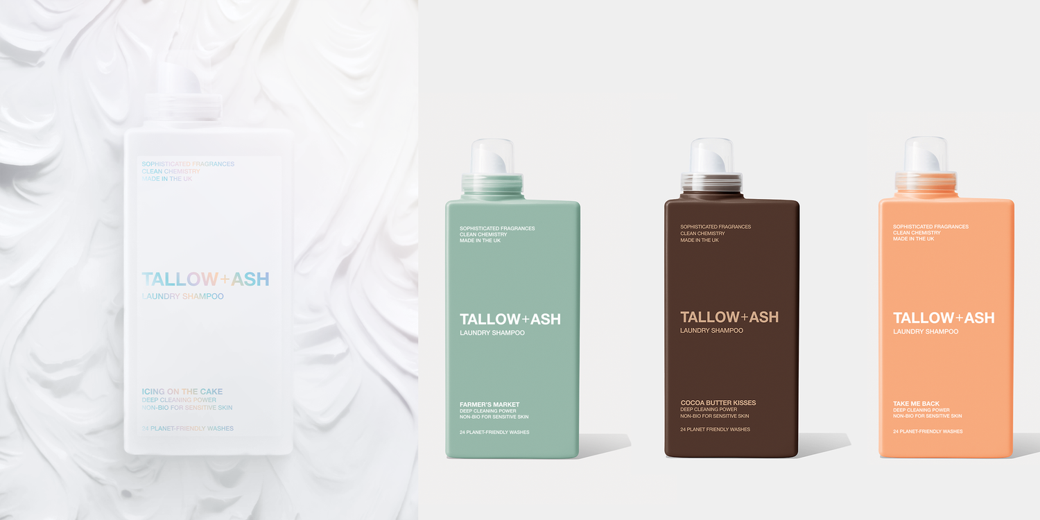
Le triangle amoureux… Notre nouvelle théorie pour créer de superbes produits pour vous !
Il y a quelques jours, nous vous avons présenté quatre nouvelles couleurs de bouteilles et vous avons demandé de décider quel produit nous lancerions ensuite.
Les résultats nous ont enthousiasmés...
Vous avez adoré le son de Cocoa Butter Kisses, mais lorsque nous avons montré la bouteille seule sans marque, c'était celle qui a reçu le moins de votes dans notre sondage.
C'était l'inverse pour le flacon vert matcha. Le moodboard parfumé était le moins demandé, mais la couleur du flacon était l'une des plus appréciées !
Donc, pour créer des produits que vous aimez, nous avons besoin de trois éléments à connecter pour créer de superbes produits : le parfum, le nom et la couleur du flacon (le triangle amoureux) 📐💗
Alors, pensez-vous que nous avons réussi ces produits ? Ou faut-il encore travailler ? Découvrez les parfums ci-dessous :


158 commentaires
Nicola Richards
All are great ideas. Farrmers Market and Take Me Back both appeal to me in terms of the bottle colour and what’s inside in terms of fragrance notes.
I think Cocoa Kisses may be a bit hard to sell. The dark brown colour is off putting in terms of a laundry product. Your mind just says “I want fresh”. Neither the colour or the fragrance notes say either of these.
Icing on the cake, as a sweeter scent sounds more appealing, but I think the white bottle doesn’t really reflect the contents. Try a soft cream for this one.
Julie Roach
The coco butter kisses – the writing needs to be white
Icing on the cake bottle is STUNNING love this
Felicia Fai
I hope you don’t mind, but I don’t like a few of your names still. How about:
Velvet cocoa kisses? I associate cocoa butter with a creamy colour, but the bottle is brown like the roasted bean. If it were creamy with brown writing, I think Cocoa butter kisses would work well.
“Farmers Market” is just wrong! Living in the Somerset countryside, stale cabbage and the smell of livestock come to mind! What about English orchard / Country Orchard?
“Take me back” doesn’t evoke the imagery you signal, not everyone will have memories of southern Italy to go back to, but maybe Roman Holiday, or Italian Bellini would work better?
“The icing on the cake” looks nice but maybe the font could be stronger in colour? The fade effect makes it difficult to read on a white bottle, especially for people with impaired sight and you want to be inclusive I expect. Its colours reminds me of “unicorn rainbow sprinkles” my daughter asked for on their cakes!
I hope you find this feedback useful! Looking forward to the new products in due course! I love Aurora!
Lucyanna Smith
Perfect
Anne Woodward
Like all the bottles apart from the coco butter one others I buy
Just received my samples can’t wait to try and order
Laisser un commentaire
Ce site est protégé par hCaptcha, et la Politique de confidentialité et les Conditions de service de hCaptcha s’appliquent.