17 octobre 2023
Pour vous impliquer dans les conversations sur le développement, suivez notre page Instagram !
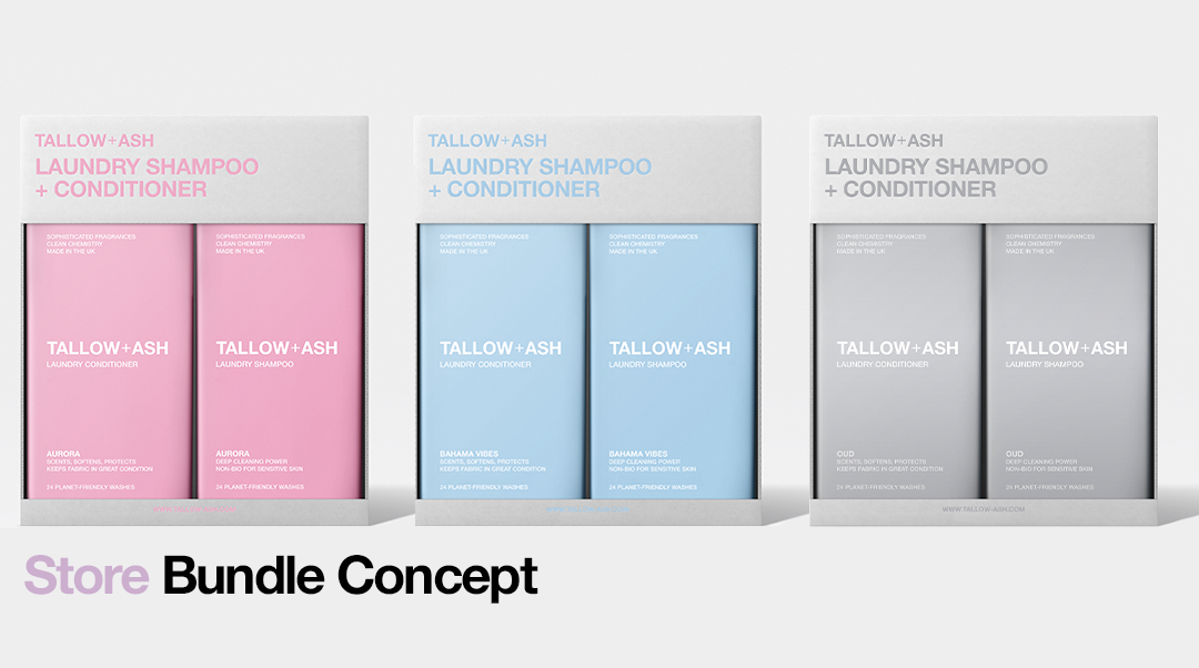
Que pensez-vous de ces concepts de bundles en magasin ?
Le mois dernier, nous vous avons demandé dans quels magasins vous aimeriez voir Tallow + Ash, et nous avons une nouvelle enquête à venir demain pour tous les clients de T+A afin que nous puissions en savoir encore plus sur vous !
Dans l'une de nos toutes premières enquêtes, plus de 80 % d'entre vous ont déclaré qu'ils récupéraient leurs produits de lessive dans les supermarchés lors de leurs courses hebdomadaires ! Nous voulons qu'il soit aussi simple que possible que vous puissiez recharger vos favoris à l'avenir, c'est pourquoi nous travaillons pour que cela se produise pour vous !
Que ce soit en ligne ou en magasin, nous voulons nous assurer que vous vivez la meilleure expérience avec Tallow + Ash. Tous nos parfums sont disponibles en shampoing et après-shampooing pour lessive, et leur utilisation ensemble donne les meilleurs résultats. Nous aimerions donc apporter l'expérience de les acheter par paire en magasin !
Dites-nous ce que vous pensez de cet emballage groupé ! Et merci d'avance à tous ceux qui participeront à l'enquête de demain. Vous êtes au cœur de tout ce que nous faisons, vos commentaires sont donc très importants pour les gens ici !


Comments (34)
Definitely white background. Good to ask people with vision impairment or colour blind to get their views?
Love this idea and so glad to be able to get them in the shops, although it is great to have them delivered too. My favourite is Oud but they all sell amazing. Cannot wait to try date night when back in stock. Highly recommend your products
I love the monochrome concept! Would love to see that in stores. Silent luxury but such a statement.
I love the same colour packaging idea as I think it is more BOUJEE!
Please consider selling single laundry shampoos and conditioners because they are not always used together.
For example – when I wash my boyfriends work clothes, I do not use the softener on his trousers. He is an electrician and often crawls into loft spaces etc. There is just no point wasting such lovely product on those.
I know TALLOW + ASH sell laundry shampoo/conditioner duo packs; however, a single bottle concept means the chance to mix and match different scents.
Imagine Date Night + Oud… I think that would smell amazing !!
I hope this feedback is useful and will be considered.
I prefer the grey bundle packaging with the matching colour lettering. I mainly shop with Ocado so I would love to see it pop up on there!
Not purchased yet but will be. Love the idea of a dual pack. I’m not sure if it would be an option for every shop as I tend to use differing amounts of wash/softener for different loads. Plus I use both products for other uses around the home. Love the coloured packaging with colour font.
I prefer same colour packaging.. to me it stands out more and looks prettier.. all the more of all the beautiful colours you choose for every fragrance..the packing will be more prominent stacked together on the shelves…♥️
Not a fan of the bundles. Not everyone can afford to shell out that amount at once. Also not everyone uses conditioner all the time and you’d end up with a stockpile of conditioner! I love the product and will buy again, but I’d like to buy what I want when I want.
I like the colour blocking too as I also find it difficult to read white font against a pale background. One thing I would say is that I like to have a sniff of what I’m buying and I usually do this by being cheeky and taking the lid off the bottle. Maybe a scratch and sniff would be a good idea otherwise I think some may break the boxing to get a whiff.
I am really happy I will be able to purchase at my local supermarket, you cannot rely on deliveries arriving so this is great news. I love all the colours perhaps pink would grab attention with grey wording
Personally I like to smell products before I buy them so would never buy a pack like this as a first time customer.
I like the grey packaging with the colour of the project highlighted; Although I think from marketing view you’d be better with a single brand look.
I would not buy in this format as I feel the conditioner is an unnecessary product. I haven’t used fabric conditioner for over 30 years. I did try the samples but didn’t find they added anything apart from perhaps some extra scent to my laundry.
I love the shampoo though and can’t wait until you offer refills..
I love the grey box with the matching coloured print.
This will make them look seamless and clean on the shelves!
Are you able to open up the outer to smell the scents?
For regulars that already buy T&A they will know what ones to go for, but for new customers they would want to open up and have a sniff, just wondering if the outer packaging would get ruined if you are able to open it up?
I love the idea of being able to pick mine up in the super market, but I agree with Sonia it would be a good idea to do singles as not every one uses the shampoo and conditioner at the same rate so you would have broken packages .
The colour block works for me.
Thank you for the T and A experience.
I think colouring both product and packaging the same looks classy.
The white background, with the coloured print co-ordinating the packaging, gives a coherent look. There is also something elegant about them being ‘same, but different’.
The fully coloured backgrounds make them look like completely different products.
Great idea love them all
I like the concept of the box matching the colour of the products. I think that you should also keep them as multipacks so the shampoo and conditioner together in a pack as if they was single packs I’m not sure as to wether pricing may change?
I also like the idea of a scratch and sniff sticker on the packets as without a doubt I’m sure someone will attempt to open the packet and ruin it just to smell it.
The concept is great but from a branding perspective, keep ‘Tallow + Ash’ in a constant colour (dark grey?) across all product lines, then use the product colour in the product description. The light grey/silver background is the more prominent of this selection
I’m an anthropologist, and digital scientist. My first thing to say is that you need to consult WCAG.20 standard and inclusive design standard for design and content standards. Make it readable for the few, not the many!
could you do a bundle for 2 shampoos as well as I don’t always want to use the conditioner.
I love the same colour as the bottles packaging. BOUJEE!
I’d also suggest selling individuals because the shampoos and conditioners are not necessarily always used together.
It also means there is an option to mix it up… Imagine Date Night + Oud! I bet that would be a winning combo.
These are great, the white background is the most eye catching and would really stand out on a shelf in stores.
I’m loving my odyssey set, I also ordered a sample pack and after explaining you guys to a friend gave the sample of the set I bought to a friend, I know you have a qr code for refer a friend but maybe on your second order you can offer a free sample to gift on to a friend? I prefer the matching packaging to the bottles and love the scratch and sniff idea above!
As a dyslexic, the darker writing on the pale background and the paler writing on the dark background is easier to read. Thanks for choosing such a great font!
Love the grey with colour font more synergy with product
Definitely loving the grey with matching colour lettering to the bottles idea best…cannot wait to see tallow and ash in supermarkets…I agree with another comment on here tho…must be available as singles too as some people only use shampoo…and also some I know use non scented liquid and buy their fave conditioner and scent boosters to scent laundry…dont want to cut off those customers…and going forward that also means when elixers hit shops…they will snap them up too along with everyone else for that lasting scent…then products would be available in every option for every kind of customer…although I love EVERYTHING Tallow and Ash …😜 so bring on T+A heaven ❤️❤️
I think the packaging is great and looks very cool. I like the grey best as it keeps all the packaging the same which will look ace on the shelves 🩶
Love this 💕
I’d say the Grey with colour font , lettering stands out and it makes the colour of the bottles pop more 😍
Can’t wait to pick these up in my local Asda 💚
Take my money and put them all in my trolley now 😍
Looks great! Prefer the white background for contrast and to make them easily accessible for all shoppers. How about the scratch to smell sticker on packages?
I prefer the colour blocking – same as bottle colour it looks more luxurious. I think the multi should be a promo bin end with singles as every day option or you’ll lose more sales in the end. Not everyone conditions everything so will run at differing rates
Having used Tallow + Ash for a few months now I can honestly say how glad I am that store availability may just become an option. I am obsessed and love the authenticity of the product and the developers. Even with the socials it feels like one of your friends talking and showing their products to the world. One life long customer here.
Definitely coloured print on white background. I have difficulty with reading white print and the grey packaging is particularly bad for me.
Love how sleek the packaging looks ❤️I personally do prefer the first option (grey packaging with colour matching the scents). A part from the pink one – but that’s be as I’d have everything pink 😂
Leave a Comment