16 June 2026
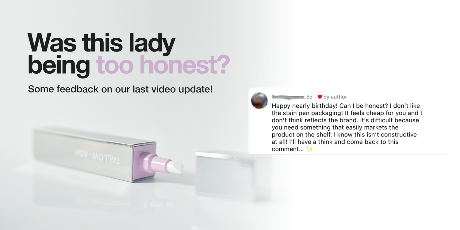
Was this lady being too honest? 🫣🤪😂🫶
We showed our new packaging, thinking it was great, and a customer commented saying that she didn’t like it 😮
But really, that comment was exactly what we needed! Because honestly, we didn’t like it either 😅😂
We are trying to do something different in laundry, to reinvent an entire industry.
And the way that we designed that first packaging was actually to satisfy the way retail is currently done! But it just doesn’t nail what we are trying to do.
So, thank you! 🫶
We are sending you a free stain pen for giving us the push we needed, and we’ve gone back to the drawing board 😂
Here’s a few shots of what we’re working on! I’ve labelled them A, B, and C so let us know which one you prefer, and we’ll make it happen!!


1178 comments
Jo Scorah
I think packaging B is perfect.
Jenny Lowman
I like A 💕
Tallulah Heselwood
C
Victoria
I like B!
Ben
A. is solid and you likely could fit more on the shelf, which is important for shelf space value.
B will get damaged on shelves quite easily. I say this as someone who worked at Waitrose for a few years and the cosmetics area constantly had damaged product packaging that wouldn’t sell.
C is decent as it has a visual for what the product looks like and how it’s used. I think it would lead to more impromptu sales, but I don’t feel it represents T&A’s aesthetic the best.
D imho looks too clinical and I think too many will just walk on by. Seeing the actual product will at least give an idea as to what they’re getting.
Leave a comment
This site is protected by hCaptcha and the hCaptcha Privacy Policy and Terms of Service apply.