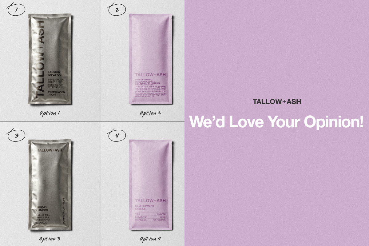
Hier bei T+A liegt unser Hauptaugenmerk darauf, die besten Waschmittel für Sie zu entwickeln, die Ihnen Freude bereiten. Um dies zu erreichen, müssen wir ständig neue Ideen entwickeln und diese mit Ihnen teilen!
Wir haben das in letzter Zeit etwas vernachlässigt, deshalb wollten wir euch etwas vorstellen, woran wir gearbeitet haben, um die Entwicklung hoffentlich zu beschleunigen und unsere Produkte weiter zu verbessern! 😍
Anstatt jedes Mal viele neue Verpackungen zu erstellen, wenn wir Ihr Feedback benötigen, arbeiten wir nun an einem exklusiven Probepäckchen, das wir Ihnen zusenden, wenn wir Ihre Meinung zu neuen Düften und Rezepturen benötigen.
Wir haben ein paar Ideen und würden sehr gerne wissen, was ihr davon haltet und welche eure Favoriten sind! 💜

Was meinst du?! Neigst du eher zum Silbernen oder zum T+A-Lila?
Wir freuen uns schon sehr auf Ihr Feedback und darauf, die Verpackung so schnell wie möglich zu entwickeln und direkt zu Ihnen nach Hause zu liefern. Hinterlassen Sie uns einen Kommentar in diesem Blog mit Ihren Favoriten!
Eure Meinung bedeutet uns wie immer unglaublich viel und hilft uns ungemein. 🥰

Comments (3059)
I usually trust uk brands but unfortunately I am really disappointed with Talis. I have tried the product in different aromas but none of this stayed on my cloths,I can barely smell little bit unfortunately.
I won’t buy again. Sorry!
I am an old user of Kifra fragrance and I will continue with this as this is much more,hundreds times stronger and longer lasting and is much more versatile. I can use it in the washing machine in the drawer for softener, just a spoon is enough and all my clothes will smell beautiful for days,or I can put 2 spoons in a bottle with some water and spray on my curtains,duvets,carpets everywhere in the house or even in the car and enjoy for days a great smell or I can add 1 spoon in the water used to clean my floors and my all house smell great.
Sorry guys but this is the truth from my side.
Kifra is £12 a bottle but I can do so much more with this bottle.
Your Product caused some itchy, skin irritation with my Wife. Must be something with the Chemicals. . .? Have to pass on any re-order
I’ll leave a comment.
I’ve contacted Tallow and Ash for a non received order placed October 19 2025, and Still … no response from this company. They get the money and don’t send the products? They don’t even apologize???
I like 9 and 10
Options 9,10 and 6 😍
I’m liking 4, 6 & 10!
I like No. 6 it aligns with your branding regarding colour. However, I think the text needs to be a deeper colour to provide a contrast. Some may struggle to distinguish between the 2 shades. Love having Celestial back, even if briefly. Going to savour this!
It 9 for me! eye catching
I love option 10
I prefer the pale lilac ones to the silver, as the silver reminds me of those little sachets you get with hair dye, which feels a bit out of place. I think the font on number 6 stands out well and is really clear, and the pale lilac fits much better with your branding. I also quite like number 10.
I think the most effective is no 9. The colours are attractive and catch the eye. Also, I don’t think there is anything else similar in the market. If you wanna know my favourite fragrance, is Oud. It is glorious!
I like the look of 6 and 10. Purple colour is nice and writing clear as to whether it’s shampoo or conditioner.
I plump for No: 9.
It differs slightly from the starter sachets, but looks elegant! 🎃
I personally love 5, because it makes it clear at a glance that this is no classic sample.
I would go with the silver in any case, so it differentiates itself clearly from the coloured sample sachets from sample packs and the like.
I am loving no.1 and no.6.
But out of the two I would pick 6 as the colour represents the scent and I like the format of the text.
No. 1, is nice but also similar to bottle
Five Stars for Tallow and Ash 🌿✨
I can’t speak highly enough of Tallow and Ash laundry products — not only are they beautifully fragranced and incredibly effective, but they also represent everything that’s right in a world dominated by big-brand conglomerates. Their ethical approach to ingredients, packaging, and purpose is a breath of fresh air — quite literally!
What truly sets them apart, though, is their customer service. Responsive, thoughtful, and genuinely invested in their customers’ experience, the team is second to none. Even the smallest query or hiccup is met with swift, kind support that makes you feel valued and heard.
In an age where quality and conscience often feel like a trade-off, Tallow and Ash prove you can have both — and smell amazing doing it. Highly recommended.
10 similar to other sample sachets but as two coloured suggests its not fully in the range yet
I think number 4, it’s in keeping with your branding. Clean and neat.
I really like 7 – it’s totally different to any other packaging that you use and the labelling is bold and clear. 👍🏼
Number 10
I love 10 and a close 2nd would be no 9. They are a bit different to your usual packaging but as these are samples they can be different.
Six looks more like the current style and has the info clearly
6 is the best, most in keeping with all things Tallow+Ash.
6 & 9
I personally think 6 is best. The colour option and style matches the brand more than silver, and the wording is light and friendly.
1 as the brand name stands out or 6as it has more info on it
6 as it gives info.
9 for a sleeker look.
Silver … I worry it is harsher on the environment.
I love 9!! Xx
Option 9 🥰
4
9 all the wayyyyyy!
Option 6
I like option 6
Layout 1 but in lilac
Loving 9 n 10 Abit more eye catching 😊
I love number 9. Love how the silver goes into the pink
I love number 1. The layout & style of the wording is pure perfection.
I like 1 or 10
I like no10 the contrast of colour
9 or 10. I like the two tone sachet.
I’m liking the two tone versions of your sachets they are both eye-catching and practical
Picture 1 and 10.
1 is simplified and looks elegant.
10 is also nice balanced two tones. Can be include the main colour what is always the same, and the second colour is tells the scent. Levander- purple for example.
I like the colour of 9 and the layout of 6.
9 with nr 1 writing
I think 9 overall is the nicest with both colours with lettering as is or similar to picture 1 x
packet 9 with the writing of 1
sample 9 looks great but maybe bold letters on the sample will catch more attention!
I like the layout of No.4 with the colouration of No. 9
10. The shiny silver is too shiny to read and the matt looks much more classic and trendy
No 4: Clear and concise
Number 10
Beautiful classy colour and distinctive!
No. 6 and 10. 6. The words are not all altogether, making it easier to read. 10 again making it easier to read placing words in each colour. The shiny granite ones are not good at all in my opinion and it makes it hard to read what’s on it.
On a different note. Sooner have you spending less money and time on packaging and more bringing the prices down for your customers. 😀
No. 4
Effortless beauty.
option 10
Option 10
The pink colours are better. Silver ones are a bit shiny and too dark.
Silver ones too shinu..Lilac better
4 & 6
T&A lilac 😍
No 6
I have failing eye sight and I can see this one best
6 and 10
Option 4. Or any of the matt ones. The silver ones remind me of condom wrappers 👀
6
6 or 8 😍
10 – not a huge fan of the shiny silver. Matt looks more classic 😊
I like option 9.☺️ It embodies the traditional T and A bit the silver makes it clear this is something futuristic, sciency, edgy.
Option 10
No. 4 – Brand colour looks better than silver & the text is nice & clear.
number 1 or no. 4
I like 1 and 4. Clean design, not too much text, so you can see what it is at a glance
9 or 4
Cheryl 9 for me
I love option 1, really modern and trendy looking <3
option 8 and option 9
Option 10 for me.
Option 9
My favorits are 1 and 4!!
Definitely option 4 as it mirrors the bottles. Continuity. 😌
Option 1 as it’s to the point and a different aesthetic to your previous lines.
Option 1
Clear and smart looking.
Personally I love 9 &10
2 and 4 are the best by far.
I like 9 & 10 best for this purpose. The colour split makes them stand out as different to the normal samples that you get with the discovery kit. There’s enough information but not too much.
Option 1 is the clearest and best in my opinion.
As much as I like 9 and potentially 10 they remind me of your already produced product. For product reviews plain packaging is best, hence 1.
10 looks pretty
Definitely 10
Hi I am looking at these from what is visibly most attractive. sample 9 and 10
Then as a maturing lady what is easier to read sample 6 &10
Regards Tracey
Option 9 looks the best to me. It looks interesting, like something special but undeniably has the T&A colour scheme.
9 and 10 really stand out as different. Maybe have the ‘Development sample’ text in bold as well.
Definitely 10 …easy to see brand and it looks great with both colours
Number 10 is my fav, simple yet super cut! I prefer all of the purple coloured ones over the silver ones
Option 10 appeals to me most. I like the lilac colour and theh wording is simple and easy to read.
No. 10 calls to me
I like 10 its pretty packaging
Option 6 as softer colour and clear
Number One the silver packaging and the bolder letters, lot easier to see especially for people with eye sight impairments . A suggestion also is maybe use the silver for the laundry liquid and the pink with bold lettering for the fabric conditioner, saves getting them mixed up.
I prefer option 1, clear branding and font is larger and clearer for the product desription
Option 6 is nice and ‘clean’ also clear to read
Option 6
It’s very clear delivery on the purpose
Of this sample. With your trademark style
Option 10
Option 6 for me as it’s clear to read and simple and elegant
Option 6 for me.
Just looks well laid out and font sizing is perfect.
I like option 6 the best, the print size is perfect I didn’t have to zoom in. Which means I will be able to read it on the packet. When the writing is too small, you are less likely to read it. So 6 is a perfect design and really pretty colour too.
Option 9
Option 10, nice and simple yet elegant :)
Option 1
Option 10 for me. I like this as none of the colours on the packaging confuses this with one of the normal samples. The information panel is nice and clear too. I don’t think the silver ones are that easy to read
Option 10
Definitely prefer the lilac, slight preference for 8.
Option 4 for me. Prefer lilac over the silver
I think Option 9 looks very sophisticated. Can’t wait to see what it is.
Option 10 really nice and definitely suits your brand more.
The silver ones look cheap
Option 10
4 or 6 for me
I like number 6
I like Oud and duvet day
I love 10- clear enough to read, slightly different with the grey band.
I’m normally a shiny magpie but the silvers just don’t suit your brand – they appear to “cheap” and this is the best quality product I’ve ever done laundry with 😊
Number 4 – it has all the information yoy need, clear & enough information
Options 2 & 4 are my favourites, definitely a lilac fan and keeping it clear and simple is always good, IMO!
Option 1 & 4
Option 4 for sure!
I like 2,+6 it’s easy for my Audhd brain to look at so easier to read
Options 8. Ideally speaking for simplicity although I’m warming to Option 1 although I’m not a massive fan of the metallic packaging but the typeface and formatting surprisingly seems to work!
Option 1
6 or 10 but if the type could be a shade or 2 bolder it would be much easier to read. Sometimes I struggle to tell the difference between shampoo and conditioner. Love the lilac
Number 9
Packaging still looks great
6 or 10 :)
I would go with number 1. Looks perfect for any fragrance sample without suggesting anything. Colour like pink for me suggest sweet floral, candy like. Silver is neutral , mysterious, special.
Option 9.
Stands out from current sample sachets and classy
1 or 9 for sure
Option 9. Classy and understated but clearly a sample
1
Option 10 ❤️
Option 4
Number 1 and 10 simple to read and number 10 as I love the colour
Number 1 or number 9 fir sure like the simplicity
Number 9 is my fave. The silver with the lilac band and the brand down the side is a really eye catching combination
I like number 9 it’s eye catching with a little colour. Stands out from the rest
Option 6
It’s clear, simple and big enough writing to ask for feedback on the scent.
Option 2 or I do like option 9 because it stands out for me a unique packaging .
Option 1
For the BOLD FONT LOGO THAT WONT BE TORN AWAY,
But in LILAC
Option 10 is my favourite. It fits your branding well
9 and 10 for me
9 or 10 👍🏻
I like 9, the type stands out well
1.
Love, love, love Oud and Golden Oud. My home smells amazing. Fabulous products. Have six more scents to try. Will never go back to other brands.
I like 10, clean, and it just looks like Tallow & Ash to me
7 Straight to the point and simple to understand.
I think number 4. Clear information and classy style, not fussy.
I brought the starter pouches and 2 bottles of washing liquif and fsbric conditioner to match. Aurora and date night. All of them just lilke water, was ery disappointed and the scent is barely there. Gave the remainder bottles away. They said the same thing. Maybe i haf a bad batch.
One and Nine!!!
I like option 6 writing but on the sliver as you already have a sample colour similar to this colour.
Option 6
1 and 10
I like Option 6 for the bold font and the easy to understand Description. Option 9 for the 2 colours used.
Option 10 for colors & Option 4 for information, ie a.mix of the two for the samples.
My favourite one is no. 6. Bold font size stating exactly what it is and asking for feedback.
I like the colours on option 10 and the design from option 4. I prefer the writing at the bottom so it can still be read after opening.
4
Option 6 & 10
Options 2 and 4. Keep your signature lilac, have writing only on the bottom so people can still read it after they tear the top off. Option 4 has clearer, streamlined info
Options 2 and 4. Keep your signature lilac, have writing only on the bottom so people can still read it after they tear the top off. Option 4 has clearer, streamlined info
Option 1
Lilac 6
1,9 and 10. Font on 1 is great as it stands out more. 9 and 10 with 9 for a more premium look so use this for limited edition scents that wont become part of the main line. 10 to stay on brand and add additional scents to the main line so you know it’ll continue to stay.
I like the writing on option 1 but on the lilac background.
Silver no 1 😍
I love options 1 and 9
Definitely lilac and no 6 😃
Number 6- and definitely Lilac over silver
I personally like Tallow & Ash lilac, option 4
I like options 1 & 9 both are easy to read, especially when vision can be an issue.
Option 3 🩶💜
Option 6, it says what it is!
Option 2
I like Option 6 the best
Option ONE for the words, and option 10 for the colours
Number 10 for me! 💜🩶😍
Love no 10, sharp packaging with just the right level of messaging!
3 and 4 are nice!
Love no 1 ,love all your products I have one for all 5 of us that’s live in my house 😁
Option 4!
4 and 10 💜
Loving number 10, has the Tallow & Ash sophistication with definition to highlight the pertinent info. My runner up would be number 4 however rather the two tone of 10. 🩷
Options 4 and 10
4 or 10 my favs
Number 4
Option 9
Overall I prefer No. 10
Number 1 & 10
No. 1 differentiates it as a pre-release sample clearly from the other beautiful shades used in the T&A range of packaging, which I think is important. It must be easy to read though, as on screen there seems to be reflection. The clear layout of text in No. 4 is just perfect and easy on the eye.
I like 9, it looks classy.
Number 1, 9 and 10. The silver colour makes it easily distinguishable from the other pastel colour samples in the discovery set and it also gives that “I’ve just been back from a lab” vibe☺️
No 6 for me it has to be. It’s clear yet simple and classy
No 6 -its clear, informative you need feedback and what product is , looks good in soft lilac
I love 10!
1 & 10
Option 1
4 or 10
The pink in option 4
Option 4, 8 or 10 for me, simply because I prefer the pink over the silver as its easier to see and read, plus the others have too much information on them and I like things that dont require too much reading lol. I just dont have the patience for it and quickly scan the text with my eyes as I want to open, use it and go!
Absolutely option 1!
I’m drawn to number 1 and 6, lilac packaging is more appealing and pleasing on the eye
No 1
9 or 10 – a combination of the brand colour and the sample band.
I think 1 and 2 stand out. 1 provides clear branding and contents but I love the lilac colour of 2. Good luck choosing!
I think no 1 best as it clearly says sample. Think the colour states neutral. Pink may assume floral/sweet smell.
Although they’re all lovely, stand outs are and nine and ten. Depending on conditioner or shampoo they need to be easily distinguishable.
I like number 1 the best. The colour differentiates it from the other samples.
No. 1
Whilst the different colours that identify the scents for T&A products are aesthetically pleasing, using a neutral sachet with clear branding and text should be more cost efficient for new/ tester samples.
Number 4, it’s clear and stylish
3. Simple and to the point. But in the lilac
Definitely number 2!
It’s classy and 💯 you!
If it’s just about the fragrance, a ‘scratch and sniff’ style perfume card would be much more environmentally friendly than a plastic sachet that is not recyclable in curb side recycle bins, especially if on FSC certified paper/card.
4 & 6 for me
Options 4 and 10 are the best. Clear, easy to read and hold all the information about the sample
I like 1 and 9. I think it’s a great idea to streamline the packaging
Definitely the lilac, it looks more classy.
I really like option 2
4, lilac looks more sophisticated.
I think 4 looks best. It is sleek and the lilac is you from the beginning. I like the simple no fussiness of 4.
Option 4 or 6. Lilac is best. Metallic is giving hair product vibes 🌺
Definitely stick to lilac – 4 is best
Lilac is Tallow & Ash to a T! As someone who has learning difficulties number 4 tickles my brain and engages me the most.
I prefer the lilac packaging and number 4 is my favourite 😊
Definitely have a preference for number 10!
Liove the option 6
Love both options 9 & 10, they look different and a bit more exciting…if packaging can be exciting looking 😂
Lilac 4 and 6
Definitely number 2
I like the look of number’s 10 and 6
Number 10 stands out for me ☺️
Hey, great idea, but i think some of the sachets they look busy on first glance.
I absolutely ❤️❤️❤️the idea of number 1, 4, 9 & 10…
10
I like No 4 best
No 6 for me
I love the traditional pink. Number 6 is my favourite I think 💞
I was drawn straight to 9, it’s shiny and I love the mix of two colours & I think it has a look of luxury.
Spoilt for choice…but # 8 or 10 for me!
I love 4
It looks classy, clean and clear.
1&10
1&10
6 or 10
6 or 8
I prefer the lilac and like option 6 the best.
9 or 10 any of the 2 tone 😍
I like 9 & 10 a bit of contrast in colour
I adore number1, and number 4.
Reason: the packaging looks smart clean and adorable chic..
Im loving option 1, its really striking and catches your eye over the others.
Leave a Comment