16 June 2026
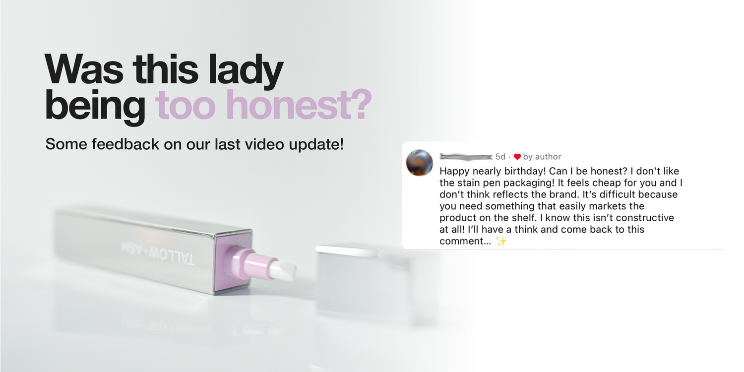
Was this lady being too honest? 🫣🤪😂🫶
We showed our new packaging, thinking it was great, and a customer commented saying that she didn’t like it 😮
But really, that comment was exactly what we needed! Because honestly, we didn’t like it either 😅😂
We are trying to do something different in laundry, to reinvent an entire industry.
And the way that we designed that first packaging was actually to satisfy the way retail is currently done! But it just doesn’t nail what we are trying to do.
So, thank you! 🫶
We are sending you a free stain pen for giving us the push we needed, and we’ve gone back to the drawing board 😂
Here’s a few shots of what we’re working on! I’ve labelled them A, B, and C so let us know which one you prefer, and we’ll make it happen!!


1140 Kommentare
Hayley Albrecht
Definitely C for me.
Dawn Jackson
C for me. Clearly shows it’s use. Love the QR idea too.
Bernadette Earley
C for me. Shows you want the product looks like and what it does
Louisa Jones
I am more drawn to B or C. There is nothing wrong with any of them really but these two are my preference. I like that you can actually see the product inside but C feels a little more like a laundry product with more information. I don’t think you can go wrong with either though.
Zoe Jones
It’s B for me. You can see the pen
Hinterlasse einen Kommentar
Diese Website ist durch hCaptcha geschützt und es gelten die allgemeinen Geschäftsbedingungen und Datenschutzbestimmungen von hCaptcha.