15. April 2024
Um an den Entwicklungsgesprächen teilzunehmen, folgen Sie unserer Instagram-Seite!
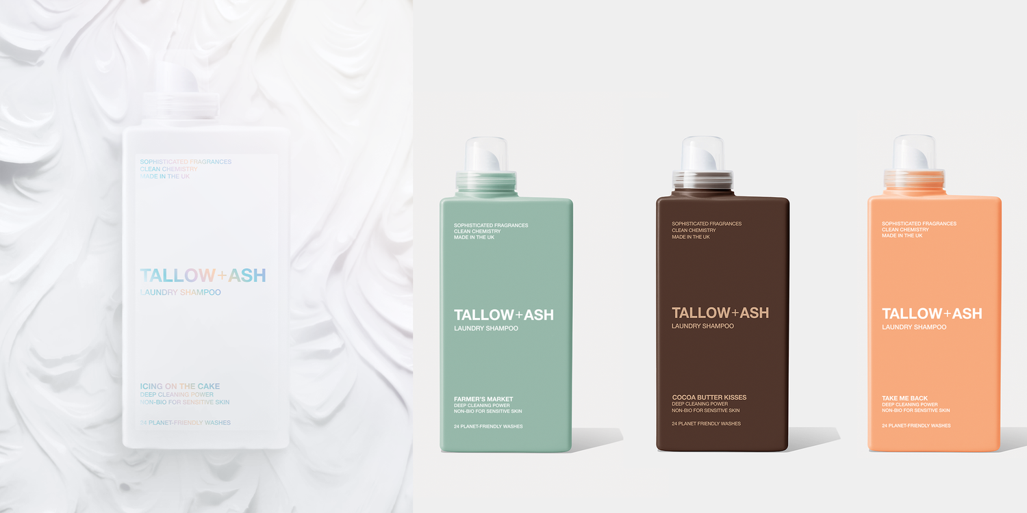
Das Liebesdreieck … Unsere neue Theorie zur Herstellung großartiger Produkte für Sie!
Vor einigen Tagen haben wir Ihnen vier neue Flaschenfarben vorgestellt und Sie gebeten, zu entscheiden, welches Produkt wir als nächstes auf den Markt bringen.
Die Ergebnisse haben uns begeistert...
Der Klang von „Cocoa Butter Kisses“ gefiel euch, aber als wir die Flasche allein und ohne Markenzeichen zeigten, erhielt sie in unserer Umfrage die wenigsten Stimmen.
Bei der Matcha-Grün-Flasche war das Gegenteil der Fall. Das Duft-Moodboard wurde am wenigsten nachgefragt, aber die Flaschenfarbe war eine der beliebtesten!
Um Ihnen Produkte zu bieten, die Sie lieben, müssen wir drei Elemente miteinander verbinden, um großartige Produkte zu schaffen: Duft, Name und Flaschenfarbe (das Liebesdreieck) 📐💗
Also, meint ihr, wir haben diese Produkte jetzt perfektioniert? Oder müssen wir noch weiter daran arbeiten?! Schaut euch die Düfte unten an:


158 Kommentare
Nicola Richards
All are great ideas. Farrmers Market and Take Me Back both appeal to me in terms of the bottle colour and what’s inside in terms of fragrance notes.
I think Cocoa Kisses may be a bit hard to sell. The dark brown colour is off putting in terms of a laundry product. Your mind just says “I want fresh”. Neither the colour or the fragrance notes say either of these.
Icing on the cake, as a sweeter scent sounds more appealing, but I think the white bottle doesn’t really reflect the contents. Try a soft cream for this one.
Julie Roach
The coco butter kisses – the writing needs to be white
Icing on the cake bottle is STUNNING love this
Felicia Fai
I hope you don’t mind, but I don’t like a few of your names still. How about:
Velvet cocoa kisses? I associate cocoa butter with a creamy colour, but the bottle is brown like the roasted bean. If it were creamy with brown writing, I think Cocoa butter kisses would work well.
“Farmers Market” is just wrong! Living in the Somerset countryside, stale cabbage and the smell of livestock come to mind! What about English orchard / Country Orchard?
“Take me back” doesn’t evoke the imagery you signal, not everyone will have memories of southern Italy to go back to, but maybe Roman Holiday, or Italian Bellini would work better?
“The icing on the cake” looks nice but maybe the font could be stronger in colour? The fade effect makes it difficult to read on a white bottle, especially for people with impaired sight and you want to be inclusive I expect. Its colours reminds me of “unicorn rainbow sprinkles” my daughter asked for on their cakes!
I hope you find this feedback useful! Looking forward to the new products in due course! I love Aurora!
Lucyanna Smith
Perfect
Anne Woodward
Like all the bottles apart from the coco butter one others I buy
Just received my samples can’t wait to try and order
Hinterlasse einen Kommentar
Diese Website ist durch hCaptcha geschützt und es gelten die allgemeinen Geschäftsbedingungen und Datenschutzbestimmungen von hCaptcha.