What do you reckon? 🥰🩵
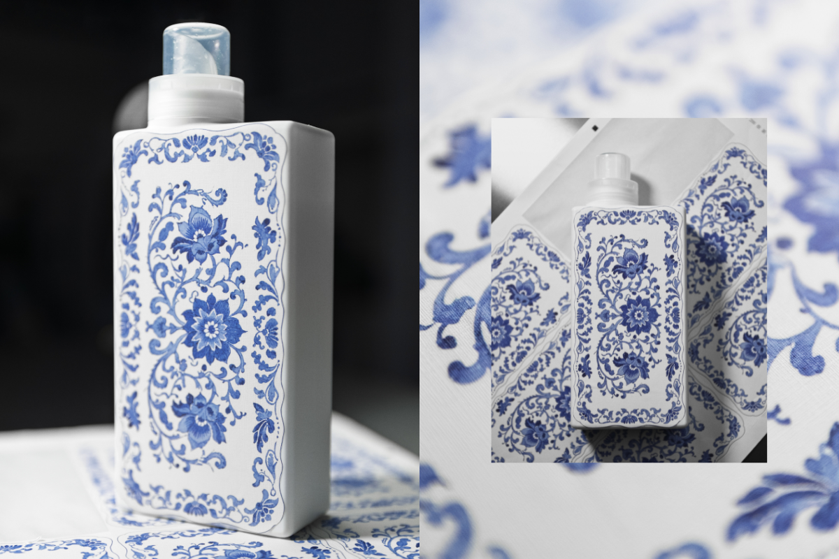
This is our first ever sample of a new print we’re testing as part of exploring beautiful upgraded bottle designs!
We’re thinking about how we can bring amazing patterns and artwork onto our existing bottles - this one is inspired by classic Spode prints and we’re so happy with how it’s turned out! 😍
The texture of the sticker gives a really warm, homely, linen vibe and the print has transferred beautifully onto the material. It’s not the final design as we still need to add all the T+A branding you know and love, but we’d love to know what you think! Would you love to see this, and other artwork on your T+A bottles in 2026? 💙


964 comments
Julie Beesley
I prefer the plain coloured bottles easy to see the difference in fragrances .
Kathy
I much prefer the lovely block colours currently in use. Don’t think it’s necessary to go down this path.
Mandie
Not a fan of the design. Prefer the bottles as they are.
Gemma Dale
I love these, it would be awesome if the banding was minimal or even make them simply arty bottles for your refills.
Also limited edition arty bottles, like day of the dead or Christmasy bottles with green holly leaves, pine needles and holly berries
Joanna Purdue
I like the idea of an arty bottle that could be refilled with anything, but I don’t like this design. It’s a bit too 1984 Johnson Brothers style dinner service for my taste. Less is more.
Leave a comment
This site is protected by hCaptcha and the hCaptcha Privacy Policy and Terms of Service apply.