What do you reckon? 🥰🩵
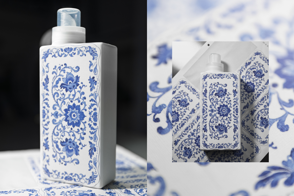
This is our first ever sample of a new print we’re testing as part of exploring beautiful upgraded bottle designs!
We’re thinking about how we can bring amazing patterns and artwork onto our existing bottles - this one is inspired by classic Spode prints and we’re so happy with how it’s turned out! 😍
The texture of the sticker gives a really warm, homely, linen vibe and the print has transferred beautifully onto the material. It’s not the final design as we still need to add all the T+A branding you know and love, but we’d love to know what you think! Would you love to see this, and other artwork on your T+A bottles in 2026? 💙


964 comments
Jem
Love it, very pretty and unique
Susan Elizabeth Ellis
Think they are fantastic would have them on my kitchen worktops. As display item. What wonderful idea 🤩
Christine Adams
Absolutely beautiful. Very excited to buy one
Julie Bessin
Love the print idea for special editions. So pretty! As long as the designs and colors match up with the scent and your logos, I think they’d be great!
Martine Butler
I strongly prefer the lovely block, single colour look to your bottles. They do really stand out as different on the shelves now that I’ve found them, even in deepest Pembrokeshire!
If you decide on pattern, then I suggest that you keep it modern and with block colours. The example you have shown may not look so good on supermarket shelves. Good luck with whichever you decide. I love your products.
Leave a comment
This site is protected by hCaptcha and the hCaptcha Privacy Policy and Terms of Service apply.