Hey guys it’s Ciara!
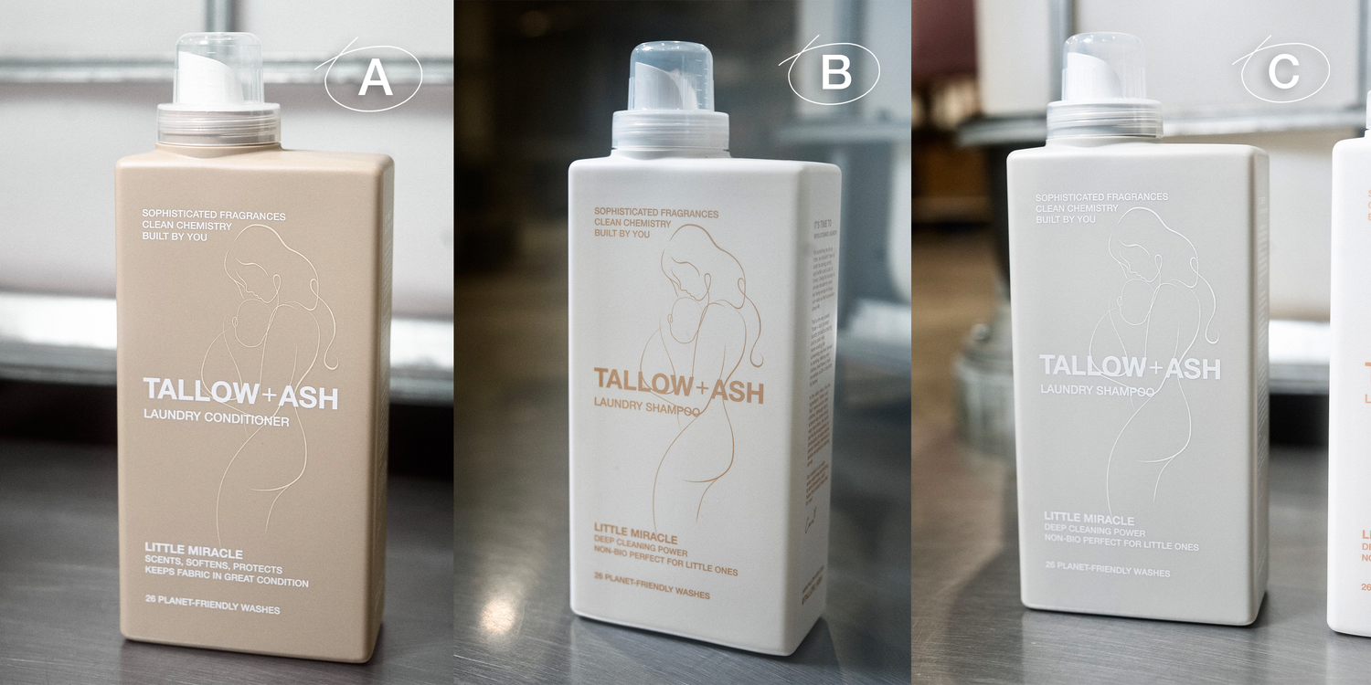
I’d love your feedback on the colour scheme for the Tallow + Ash baby specific fragrance! A, B or C?
We’ve been working on this since I was pregnant just over a year ago now. While all of our products are non-bio and suitable for delicate baby skin, when choosing a fragrance it really put me in the mind of what a parent thinks about when washing their little one’s things.
I chose Duvet Day (French Lavender), and Aurora (Rose) as she’s a little baby girl! But I thought it would be amazing to have a baby specific product in the range so parents have peace of mind that it is made specifically for them.
We showed you guys some initial concepts and you really loved the idea too, so we’ve been working on finalising the fragrance, formula and bottle and we can’t wait for you to test it very soon!
We have 3 bottle colourways that have just come in, and we need help deciding which to go with! If you’re a parent we’d love to hear which one you’d go for! Check them out below.
Thanks to everyone for their constant feedback and involvement, we love continually developing this brand with you!
Ciara xx


Comments (1061)
B — cannot wait to try it.
B 🍼
Option B, I was thinking to message about a baby range, then saw this, looking forward to trying out.,
Yes, I go for B 💕
A
B – definitely, cannot wait to buy it. xx
B 🤍
Definitely B- white is pure and that is what a baby is!
B from a grandparent:)
B
B
B – The design really stands out & shows the most 😊
Definitely B. Or C. Not A – it looks just like duvet day.
B ❤️
B
B
B – neutral and classy looking, smart enough to put on display
B <3
B
B -
B is suit the mama 😉
B is lookin’ sleek and gorge!!
B for sure it looks beautiful : ) :) xx
B 🙂
B it looks so appealing aesthetically xoxo
definately B
B for sure!
B definitely looks beautiful
B is beautiful!
Definitely B
A for me as it is different from the rest of the range and wont be confused with the other fragrances
I love A
It adds a warm feel to the home
B all day long for me. It’s attractive, eye-catching but neutral, gentle yet strong and simply screams “motherhood”. I love it. I’m not a new parent but, my youngest daughter has just found out she is pregnant so guess what she’s going to be getting in her layette?
‘B’ it has a greater attraction and stands out with sophistication
B – looks ‘up market’ whilst appealing to other parents in its marketing. Colour scheme is perfection
B
C
B Looks like a luxury product
B!
Stands out the best.
Definitely B – very clean and pure
Hi guys!! I can’t wait to find out what fragrance this is. I think it’s definitely option ‘B’ for the packaging!!
B, I think it stands out best 🙂. Love all the fragrances you do .
Definitely B as stands out so much better
As a mum of 5 kids (15 the eldest and 5 months the youngest) I love Tallow and Ash
We have varying sensitivities in my family and this brand hasn’t caused a single issue. Ugh where were you 4 kids ago…. lol
Prefer B – images standout clearly
B. My favourite is Duvet Day too! My little one is 5 months old xx
B
Beautiful with clear text that stands out better.
B
Just looks more pleasing to the eye
B for sure, A looks very similar to Duvet day
I absolutely love a I think they’re all lovely and the images on there are just perfect. What a lovely brand.
A Just looks cosy and snugly to cuddle up with your baby.
Definitely B. The image and text stand out. Unfortunately the others all blend together. Very much like B’s colours too
B
This combination stands out the most, lovely design for a lovely company.
B
Most distinctive design.
A & C too similar to other scents/bottles
Definitely B.. I love that colour way! 😍
I’m an artist ,well like to think I am lol.
But seriously I’m a mum and love the look of B. Is there a sample of thr baby range coming soon? Please
As a mum to 6 children I would definitely go for B. The most eye catching by far in my opinion
B
B
Definitely B. It’s warm and the contrast is soooo pretty
B, clean, crisp, packaging with clear linear image and typography referencing laundry care relating to children. Differs to the Core Range however, option B stands out and is best representation out of the x3 options for the ideal intended audience and parent market.
B 🤰🏽
The image pops on this colour combo! 🫶🏽
B makes the image pop and less confusing with other bottles !
A
Its B from me as a grandparent, but pure and simple colour scheme to match your pure ethos, the design also stands out best on this colour way.
B for me! Makes the silhouette stand out more
C 100% 🫶🏻
Definitely B. Really lovely !!
It’s got to be B ❤️
It’s B for me!!
It’s got to be B stands out more and it looks gentle and pure, love it💕
I love B
B – the best of both!!
I think design B! It screams motherhood to me! Looks gentle and comforting!
I love B as it’s clean and the image is a bit clearer than on the coloured versions.
I love A think it looks stylish
I like B, pure, clean and gentle looking 🤍
I think B. The colour scheme is perfect but maybe just include images of little ones might be better
A but the image could be in dark grey maybe to make it more visible. Otherwise B
B. It stands out more
B looks good but a pic of just a baby might be more appropriate and gender neutral 🤷🏼♀️ ☺️
I like B – the picture looks really clear and a gorgeous colour xx
I prefer the colour of A for the bottle, but the graphic is not clear so perhaps needs to be thicker so that the graphic looks as clear as it does on B. Perfect colour for gifting for a gender neutral yummy baby fragrance! Wonder if the graphic should be a baby though as pretty as the current graphic is
A for me. It’s classy and classic looking
It’s B for me 💗
C as its very neutral and looks good on an open shelf.
I like B – looks cute!
B it stands out
B stands out the best c
Got to be B for me.
Gotta B the B!!
Loving the B
I think B is the best option.
The contrast on B makes it stand out against the rest, it gets my vote! :)
Can’t wait to use something baby specific from T&A for my baby clothes!
They are all lovely! But B for me, it shows the image & writing more clearly than the others. So happy this product will be part of your collection!
Can’t wait to buy this and for me, it’s B x
B
B looks the best
Option B
B
Definitely B ❤️
I think B 😍
It’s so hard to chose from A and B but I think I’m leaning more towards B. Definitely not C though!
B for container design
Bahama Vibes is the favourite with my elder grandchildren for their baby brother – and they love walking in to the utility room when the laundry is being done.
B for baby 👶
So excited baby on the way!!
A for sure! ✨
A
A!
B!
Absolutely A! X
A – it looks so calming and ‘comfy’. Can’t wait to try
A for shampoo and b for conditioner
Love the T&A products but I feel all 3 options already look similar to your other product lines. Once you’re in Tesco, you might want this line to really stand out from the others. Personally would go for another colour and amend the image to just show a child/baby. Mum of 4 here so I will definitely be buying! Good luck with the launch.
B – the colours match the theme perfectly and also the design stands out much clearer x
B looks great. Like A as well but the picture doesn’t stand out as much.
I think A looks lovely and calm looking. Which need as so hectic being a mum and staring at the mountain of washing building up.
B
B is completely perfect 🤩
B would be perfect. Looking forward to purchasing some!
Definitely B for me! Feels more pure and the illustration stands out the best 😊
Definitely has to be B.
The white evokes thoughts of purity and innocence, exactly what you think of with tiny newborns.
Both my babies were brought home in bright crisp-white outfits.
Definitely B the beautiful illustration stands out well against the background.
B
B
I prefer colour B , a softer purer colour fir a baby 👶
I think b looks the better one xx
I think B looks the best
Hmmm I don’t love any of the 3 your other fragrances are ‘wow’ lovely and for something as precious as our little miracles I think it needs a wow design. Out of the 3 B is the best but does look similar to icing on the cake and my hubby will probably mix them up 🤦🏽♀️
I prefer A I think it is stylish and will work with most decor.x
B is the one that my mind instantly went to :)
I think B looks the better of the three designs.
Hmm, they’re all lovely but I’d prefer a colour that’s totally different from the other products in your range (duvet day, icing on the cake and oud) so I can tell them apart in the cupboard! 💗
B. Timeless and classic
Love B classic look
B!!!! 🥰🥰
Definitely B. The silhouette is simple and classy.
Draw back is same sex male couples cause a fuss.
I really like A.. it’s so cosey and like thst its gender neutral too.. works as a good neutral alongside all the other product colours if you have two together
B 🤓
I love the first gold/Beige. Would have chosen white but that would create conflict with my favourite IOTC! I feel the golden colour is also more inclusive and feels ‘special’!
B!
I think A! Honestly if I was tired and grabbing a bottle I’d get confused between the other two and existing scents I have!
A looks more calm and cosy…
like snuggles with your little one.
I think B, the image stands out more :)
I think A
I like A but too similar to Duvet Day and the silhouette doesn’t stand put. B stands out much better for the Mum and Baby silhouette so much clearer branding for baby product
B , it’s the most neutral
B!!! Really stands out from the others. Have always used Candy Beach to wash my baby’s clothes and works so well with the stain remover! Absolutely fab on his sensitive skin 💕
I’d chose A for my lovely grand babies xx
A. The look is softer and not as harsh with the contrast as the others and you can still clearly see the mum and baby
Definitely B!
B stands out the best ❤️
I’d say B, the silhouette stands out the best
I’d say go with A because it’s a stand out from the others. B and C are too similar to Oud and Birthday. Keep up the great work!
B for me, looks appealing and messaging clear
B. Is by far, the best in my humble opinion.
It’s B for me, silhouette stands out really nicely.
B for me!
B
Definitely B you can see the mummy and baby print better xx
B for sure please… Love the colour combination
A 🤞🏻❤️
Definitely A!! It gives me an immediate feeling of calmness and serenity.
B!! Very subtle, elegant style
B
Definitely A!!! 😍😍
I’d definitely go for B
For me B differentiates itself just that little bit more from your current product range colour schemes than the other two.
Like some other commenters have already said, my children are adults now but there’s so few laundry products aimed at little ones that if I had them now I’d go for B.
A!
Definitely B it looks fresher and brighter, the design is more noticeable.
I really like B. It stands out from the other two
B, definitely.
B definitely fits the bill
I like B
B is my choice.
love this colour way, I’m a little bit older my kids are 37 and 40 this year but if I was just starting out on my journey this is defo the one I would choose. X
B looks the best to me !
B
Definitely B! Really clean and fresh looking – perfect for baby!
B,for Babies 👶
I would say that A matches a lot of neutral aesthetics parents go with but i agree with other commenters that it looks too much like duvet day. I would also go with B.
B , for babies
Got to be B, A looks like duvet day and C looks like oud
B 🙃
Definitely B for me
Hi
Its B, it looks comforting and a beautiful colur which makes the logo stand out.x
It’s ’B’ for me. Great colour /packaging 🥰 👶🏻
Has to be B for me, you can see the design more clearly and it looks fresh and gentle in that colour-way
B it stands out but still has calming/caring colour scheme!
B
I would go with B. It stands out a lot more than the other 2.
B for me xx
They all look amazing but B is timeless whereas A is one of the “in” colours right now. I love how elegant it is 💖
B
All look fab but I think A
C for us!
It definitely has to be B for me as it is the clearest and more identifiable bottle of the three.
It is a B for me! Easy to read and clearer
Yes!
B stands out the most as you can clearly see the beautiful design of mother & baby and as consumers automatically associate White with ‘Pure & Clean’ together they emphasise it’s a gentle product.
I have been using Icing On The Cake & Aurora on my baby girl!
B has a very defined clearer image on it. Shows up better 😀
Definitely C! 😊
I love B!
B – for baby!
B
B
B
I think B looks the best.
B
B is my favourite!!!
B stands out the most x
I think B is absolutely perfect
I Love the simplicity of B x Good luck
I think that I’d definitely choose B ! Its really stands out to me from the others!it has a clean, soft, and gentle design. The white bottle with warm beige text and minimalistic illustration conveys a sense of purity and safety—important qualities for baby-related products.👶🍼 The overall aesthetic is calm and reassuring, reinforcing the idea that this detergent is formulated with care and safety in mind.🤎🤍
Love the packaging on this one
B definitely!! Design stands out a lot more!! And I always dressed my babies in white so I can relate to the colour more.
Lovely idea!! Well done again!!x
B
C is my favourite 😍
Definitely B. Makes the pregnancy / baby image stand out and is distinct enough to not confuse between your other bottles.
Definitely B. I love Cocoa Butter Kisses and Icing on the Cake for my 5 year olds laundry!
Definitely vote B, the other two colour ways look to similar to scents already on offer, also I think the picture stands out better. 🤍🤎
A it’s a beautiful neutral colour for a wee baby girl or boy. The middle one looks very like birthday and c looks very like oud…my absolute favourite!! Good luck in choosing the best one and I’m sure you’ll make the right decision. Tracy
Definitely B 👶🏼
Defo B
A looks lovely and neutral 😍
I think B because the design can be seen more clearly and it gives the appearance of simple purity – all babies are pure, innocent and beautiful!
B
I think a rainbow colour would have been different and would have stood out from the rest of the range.
B for sure!
B looks good
Definitely B
A, looks very appealing but,b is best for colour range, also love the silhouette its brilliant
White also tricks your mind into thinking baby cotton and pure
So definitely my vote is B
I think B is the best option as A looks too close to Duvet Day and C is grey, as is Oud, although perhaps not as dark toned
B
B👶🏼
B. The white bottle is the colour of a fluffy cloud
B is the most pure and lovely
B is perfect , it just looks pure.
B for me.
I think B is the one that draws me in most.
B for sure! Beautiful and delicate just like your products ♥️
I love B graphics are clear and the aesthetic is perfect
I think B the image is more visible which gives clear marketing that this is a baby friendly product. As for scent, I love duvet Day but it is too strong. Aurora is a beautiful subtle scent. I am yet to try the other two. If duvet Day could be toned down I think it would be perfect
B is so simple & beautiful. I love it 🤍
B definitely. Everything stands out better ❤️
B as the pale background with the prominent text is a winner for me.
I’d go for A x
B is my favourite. X
I think that B is beautiful 💜
Definitely B. The outlines on A and C are too faint🤍
B – the imaging is beautiful and clear 😊
I’d go for B, the graphic stands out better, the other two at first glance look like duvet day or oud.
Greetings! B X
Leave a Comment