16 June 2026
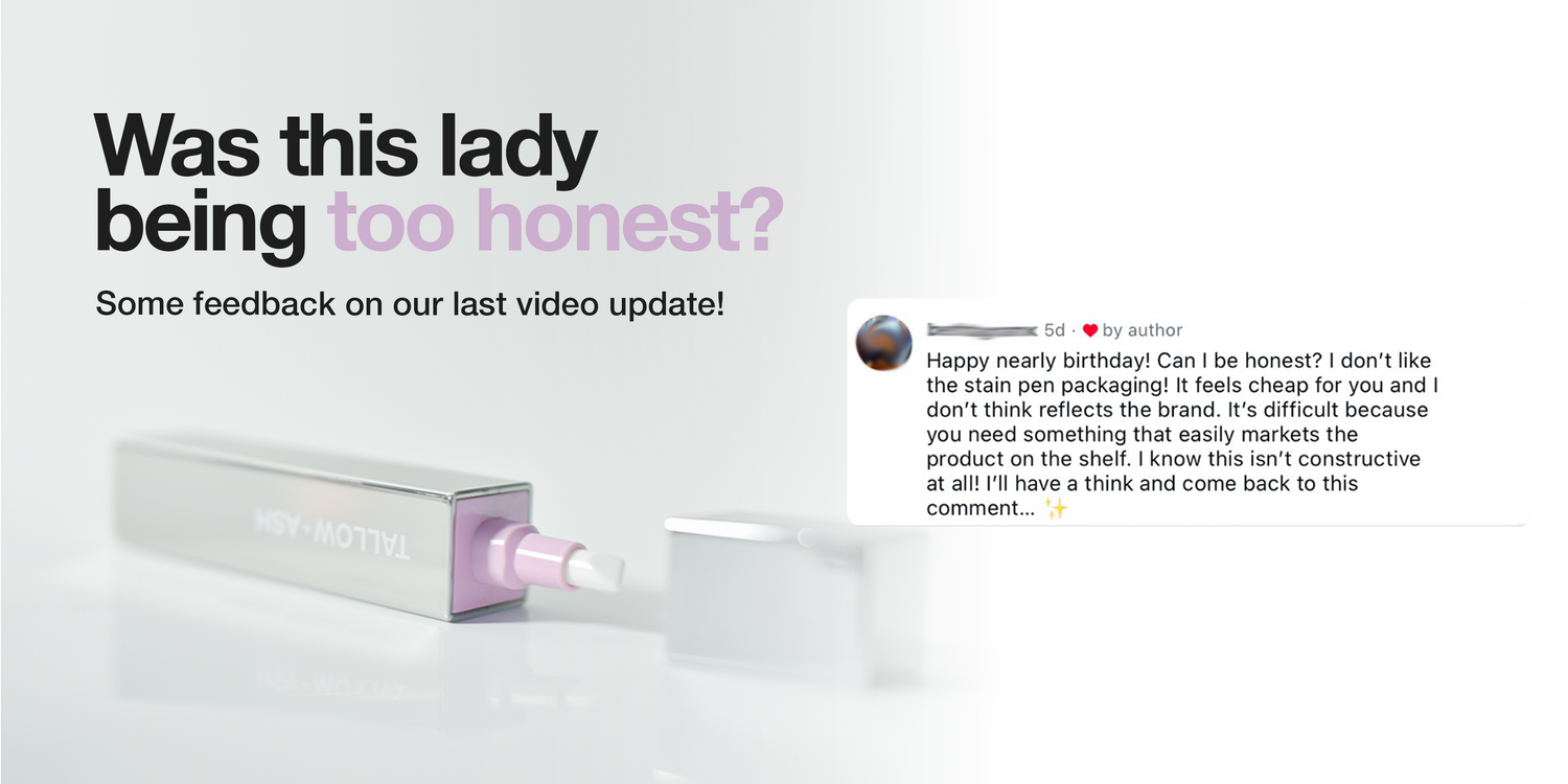
Was this lady being too honest? 🫣🤪😂🫶
We showed our new packaging, thinking it was great, and a customer commented saying that she didn’t like it 😮
But really, that comment was exactly what we needed! Because honestly, we didn’t like it either 😅😂
We are trying to do something different in laundry, to reinvent an entire industry.
And the way that we designed that first packaging was actually to satisfy the way retail is currently done! But it just doesn’t nail what we are trying to do.
So, thank you! 🫶
We are sending you a free stain pen for giving us the push we needed, and we’ve gone back to the drawing board 😂
Here’s a few shots of what we’re working on! I’ve labelled them A, B, and C so let us know which one you prefer, and we’ll make it happen!!


Comments (1178)
C
Option A ✍🏽💜
I love the stain pen but the magnet is so weak and the lid comes off all the time. I just use the refills as the pen instead.
Stain pen, stained my top while the food mark has gone. So as I got home I rinsed and washed in your stain powder following instructions.
Unfortunately still there ?
A
I bought this pen a while back and it’s brilliant.I take it out with me when I have food just incase I spill something on myself.I don’t know what that person is talking about.I use your washing liquid and conditioners I highly recommended them.😍😍😍
A! It shows the product but protects the pen from scratches/scruffs so the pen still looks luxurious and clean :)
Prefer C
A plane and simple and have all info on the back.
C it will have more impact on store display/shelves as it’s larger but also having information on the packaging will help consumers and hopefully sell itself.
I gave one to a friend who had a mishap on their sofa and their daughter saw it on the side in their kitchen and thought it was a lipstick so definitely needs an upgrade to save any confusion.
Design C suits your brand the best!
Hello I think C. Looking at the packaging doesn’t just tell you but you have the visual aid too which is great. My eyes are awful and that definitely helps.
Keep doing what you’re doing
Take care everyone. 🙂
I’ll choose C as it’s looks more professional.
C. It looks less like a lipstick!
I like C, but change the hand to a neutral gender one so it isn’t as sexist
C – if you sell in a shop. If you’re buying online then B, as you’ve already bought it, so don’t need all the marketing info. By the way, sexist alert! Can you change the picture to a male / ‘neutral’ finger in the image rather than a female painted nail?!
I think C is the best as all the information is there
I think c represents your brand better , it’s cleaner but still tell you everything you need to know x
B less packaging but still has class
I prefer C. It’s clear, sends message right away. No confusing add ons.
B less packing
I think C is probably best, especially for attracting new customers to the brand because it gives more information.
I like B (visable backdrop is very T+A) but I worry without plastic it’s easy for the pen to be stolen out of the package 🫣
C also gives a beauty/cosmetics feel that I think would stand out in supermarkets
I prefer A…..simple
B less packaging but still smart. No plastic.
C – shows your iconic logo, says what it is and no platsic.
Has to be this one🥰
B less packaging no plastic
C – it says and shows everything you’d want to know about the product.
C shows exactly what it is with the brand name on show.
C – clear and tells you what it can do. Simple and does the job
I like B, because there is less waste and you can see exactly what you are getting.
Original all the way. For me it’s the only one that aligns with the general vibe.
A as there’s less plastic, to be honest I prefer the original as its easier to recycle as cardboard, otherwise you have to separate the plastic from the card
B as long as there’s no plastic over the top of it. Less waste.
Also, are there ever going to be different scents for the stain pen? The current one is ok, but not one I’d choose if there were alternatives
B less packaging waste
C
🎃
B
A – but with the explanation of c on the right hand side of the package.
C is definitely the best.
I’m a graphic designer — including a product packaging designer. Please get in touch with me if you need any input. The original is fine but C would be a good choice. Avoid plastic in your packaging. Apart from the environmental aspect, it actually cheapens the product. You also need to consider anti-theft measures sadly. I still think there is something different to be done that plays with textures and certain redesigns. I don’t think you’re quite there yet with the current designs.
Good morning,
Decisions decisions…. of course packaging is important it’s what first attracts you to the product isn’t it so getting it right is imperative…. I have to say I do really like A and B, both simple yet classy and a brilliant addition to your products. BUT, like so many have said, we are supposed to be cutting out the plastic….. sooo, how about you use C but have a peep hole in the packaging so everyone gets to see the how gorgeous the product is… either a fat open square on the front or a long skinnier strip the length of the box obviously not big enough for the product to fall out or some horror pulling it out of the box to steal it but just enough to give prospective buyers a peek 🙂
… Does this make sense? I hope so… I know what I mean 🤣😂
Good Luck
I really like the current packaging otherwise C is my favourite. I try to minimise buying single use plastic so A and B would put me off a bit
I use to work in asda.
Se many things get nicked, so thinking on them lines, if going in to supermarkets you packaging may need to be a bit bigger,
An silled in to make it harder to take, cos it’s just pocket size, but then again if you want it that bad you’re just take it.
Oh one more thing put security pages inside filled packaging, before it goes out.
Thank you .
I like package b although I think c looks the most upmarket. I love mine and have one near me at all times. I absolutely adore the scent and almost wait for someone to splop something lol
If A & B are going to have plastic so you can view the pen and we’re supposed to be using less plastic is maybe not a good idea, C seems to be a better idea
B
B
C
I was also honest, the stain pen doesn’t remove curry stains. And the elixirs do not improve the fragrance on my washing.
Please sort out what needs fixing rather than the packaging!
A
I think B & I much prefer mat finishes everything (apart from my nails of course 😁) shiny can look cheap so I do agree with the lady good on you for listening 🫶
B, A , C
B or C
Personally I don’t think the packaging is the problem I quite like the current one. I think it’s the pen itself. The plastic feels a bit cheap. I think a matt plastic one would work better and look a lot better.
C is the option that I think would make me buy the pen (if I didn’t already have it). I like the QR code and I think the larger packaging will make it more visible on the supermarket shelf.
I love the original package! But if I had to chose between the 3 I would say A.. I’m obsessed with this product and have recommended it to friends, family and clients :)
I like the look of option C packaging, but I’ve never tried the stain pen so it’s a cheeky choice based on no knowledge!
I like C – it’s very clear what the product is I like the emergency stain remover pen bit.i don’t like the one where the pen is open in the packaging it could get damaged easily also if in a store people might be touching it a lot and leave finger prints on it also people could find a way take it out I guess. I think this product is AMAZING. I spilt beetroot on my favourite pale jeans and it got rid of it instantly !!! Fabulous. I personally love it. Thank you
I think B as it shows off the Boujee pen inside. It’s like a lovely lip gloss.
I like A and B- they feel more exclusive
I like B I think the product is fantastic and all my girl friends have purchased it after seeing mine.
I like B . It’s clear. You can see what you’re buying. No extraneous packaging.
I was also honest, the stain pen doesn’t remove curry stains. And the elixirs do not improve the fragrance on my washing.
Please sort out what needs fixing rather than the packaging.
I prefer C. It’s clear , clean and doesn’t detract from what it is and has the information needed to make an informed choice. It’s attractive in a way that, I think, the others are more visually cluttered.
I like option B. I feel that it’s more environmentally friendly, as there isn’t an excessive amount of packaging. Option B also allows you to see the product properly without having to open the box.
I like A, the box holds it well, the product is visible, and it’s easily recyclable
My favourite is B. I like the colour. The current box is good in my handbag but would get missed on supermarket shelf
A
I think B is probably the best out of all of them but maybe add sides so the product is more secure. I’d also make the window a little smaller so you have space on the front of the carton to put a little info like C with the ’No more drinks spills, food stains, or make-up transfer ’.
I do like A and B but I feel these boxes will get damaged easier and the product could come loose. Causing loss of profits etc. C is good but do we really need that extra card at the side. Don’t like the plastic on the archived concept. But i do like it info on the card. So I think what I am trying to say is the current packaging is just right! However I think the archived one would be good in all cardboard as it could be hung up in stores and recycling would be easy.
B
I like B
A
C
B
I like A
B.
C or D, I think.
Open windows and sides get damaged too easily on the shelf.
I don’t have a problem with the packaging at all, what I find difficult is knowing when the pen is running out, there is no window down side to see this, hope you can take this on board😊 Love all your products 😊
I like A & B. Simple and elegant.
Whilst we are talking about the stain pen; I love it! But, the lid is a pain. It falls off when it is in a bag and it feels a bit flimsy.
Regarding packaging of the stain pen.
I like the original and A both look more ‘upmarket’ than the others
The open window and one with tab for Qcode are likely to catch and look tatty quickly.
I like the original packaging and also A.
A
A
I like C as I think it says what it is.
I like C as it is classy and tells you what it is and does
I like C best, but only because it tells you what it does on the packaging
Definately A
A less packaging, sealed hopefully less able for people to tamper with it. Draws the eye in.
I like the original packaging. It looks classy.
I love A because it shows what it looks like.
I think C as it has more information with the QR code included. The only thing I’m struggled with is knowing how much liquid is left in the pen so maybe a see through line to show the liquid inside would benefit customers so they know when to order refills as I’ve completely run out and would have liked a warning beforehand
I vote C
I personally dont like open packaging.
It’s a perfect product.
I prefer ..B as I think it looks more classy
B….it looks classy and professional.
C as helpful to have the extra information
C for packaging and B for pen .
But i buying for how it works and it works amazingly well
I like C because it is clear exactly what the product is and shows a picture of someone using it. No confusion for the consumer!
I liked it but my only negative point was that it took me an age to get the empty cartridge out and put the new one in !
I watched the video several times but I kid you not, it took me almost half an hour to twist it out and I’m not exaggerating .
I almost threw it and the refills 🤣
C or the current packaging 🙊. Don’t want an open packaging for hygiene reason lol.
C
I prefer B
Really looking forward to the tumble dryer sheets .
without a doubt C. And I am glad others feel the same…😊xoxo
C!
I like C it shows the pen and explains the product. I love the stain pen T&A it’s my favourite handbag addition 😊xx
I like the silver packaging. Of the other choices I prefer C.
C
I prefer option C. The other packages look a bit more like mascara packaging to me, whereas C feels more distinctive and better suited to the product.
The branding on option C is also much clearer and more visible, which gives it a more premium and professional appearance. I really like the pull-out panel with the additional information on the side—it adds a high-end feel and makes it easy for customers to learn more about the product. The addition of a QR code is a great touch as well, as it creates a “try before you buy” experience and makes the packaging feel more interactive and customer-friendly. ☺️
I really like B.
Love all your products.
Once I get tumble dryer sheets I will be a happy launderer
B for the product case, it looks sleek , and C for the packaging, it’s got clean lines it tells you exactly what it is, all in all a much better option for me
C
C
C
C
C
Current packaging is the nicest. Simple, classic and effectively tells you what you need to know.
C- informs better; no plastic; maybe ocuppies a bit more espace on the shelf but… as it should! considering the size of other products/bottles surrounding it (assuming it will be dispkayed in the laudry section); it should be also found next to make-up products – the best companion …how genius! Thank me later 😜
C or current packaging.
Be for me but most important is whatever is the most e-co friendly. That goes for all your bottles and packaging
C please x
I love the original packaging, I carry it around in my bag all the time, the packaging is recyclable, don’t like any plastic
I like the first one, A. The packaging keeps it nice and snug and the picture shows clearly what the product is.
I think C. I actually like the current packaging but it might not stamd out well on a retail shelf. Not A or B if you would need to use clear plastic in the packaging for the window – no unnecessary plastic please! Love the product though, keep doing what you’re doing!
I love the fact that you are an industry disrupter and aesthetically it’s pleasing but my first thought was little people thinking it is make up.
Prefer packaging of C or Archived Concept – messaging is direct
B definitely very stylist and is a great addition to your branding
I would go for C I prefer the more muted packaging, also the first 2 wouldn’t be protected being open and look cheaper than the bigger branding enclosed box. The current packaging also looks classy
B looks the best, most attractive with silver and colout behind it, clear what it does and doesn’t look cheap
Prefer current (not archived) or C purely because I can see the packaging of the actual pen getting scuffed in the open versions.
A by farrrrrr
I vote for C.
I think the stain pen is amazing and you need to shout it from the rooftops!
I personally try to avoid plastic packaging so also am not keen on your other new concept.
I would go for B
I would choose B
B
I prefer the look of B but like the listed information on the Archived Concept if this could be stated on the reverse of the B packaging.
B
Definitely C. Looks like an expensive mascara or lipstick
It’s B for me. However, I do like the video link on C.
I like C
B
B. I like that you can see the product but do like the picture on C !! Not helpful I know !
Ps the product is amazing !
I think the current one is ok. I’m just keen for as little plastic as possible.
I think d the current packing best reflects that brand, is plastics free and stylish
A
I prefer C – for people who have never used it before the addition of the video link is a great idea. I do think the words “emergency stain remover” need to be on the box though. Some people won’t get the “on the go” statement.
Its a brilliant product, I use mine all the time and I’ve got lots of friends who have ordered!!
B, it looks more premium.
B is my favourite, no plastic is very on brand, and i love being able to see the actual product.
I prefer B
D – no plastic, keeps it simple, and avoids the pen itself getting damaged or scratched in transit.
I prefer A, this looks great
The info on C is needed for people who have never seen this before. You are not showing the backs! I prefer A but with a smaller window to just show the name. That will give you more space to put info on.
As another thing, why don’t you sell this NOT in a pen so we can use it at home for our laundry? I have to use the pen and I am sure you could sell a more economical version for home use???
Definitely B it looks more peasant to the eye and not all just a box. The visibility works
I prefer package B
B is my preference. Less packaging, no plastic.
Definitely C. I feel for retail it gives an immediate visual of what its for, whilst look smart.
I like A or C. I feel B is too open and likely to tear when either being placed on the shelves or when customers rifle through perhaps thinking there are different variations. I agree with the comment that initiated the vote, plastic packaging although robust is a little old hat. Companies and customers are moving away from single use plastics so personally I don’t like that package.
A box made of card is far more appealing as it can be recycled with relative ease.
I like the QR code idea, maybe that could be incorporated into the packaging whatever design you decide upon?
The current packaging is great and nothing wrong with it, compact, eco and premium. A & B look like they should be on a make-up shelf. C works but it’s the extra use of material that is unnecessary from an eco perspective but would be my second choice.
I like B or C if I was pushed C, thank you for the opportunity to give our input
Agree with B and many of the comments – reduced plastic, recyclable packaging, clean and simple packages with minimal but informative text. To me these are core to the brand and packaging should reflect that.
Honesty is always the best policy!
Out of the new options I am personally more drawn to B.
It is classy, simple and I love the coloured backdrop and being able to see the item.
B is my preference. Less packaging the better and no plastic.
I like b or c. C is a popular design in cosmetics. Also please consider people with bad hands. The plastic on items is difficult to get into. For me no plastic that needs scissors. Thanks
I like A.
By the way, I don’t like that you call your detergent and softener “shampoo” and “conditioner” and put them in identical packaging. This is confusing for people with neurodiversity
I’d go B
B, can see the pen, looks sleek, minimal packaging so less waste and put the qr code on the back?
I’d choose B or C, but B actually shows the pen so maybe that one wins my vote.
I keep meaning to order one but was waiting until I order some more products so that I don’t have to pay a lot of postage on the one item. ( Not in Tesco’s yet!)
I needed it yesterday more than once, between myself and friends on our day out!!
I like A, you can see what you are getting and maybe you could put the QR code on the side of this rather that having extra cardboard on the side. Eco friendly as less packaging that way which appeals. Love the stain pen its a game changer 🙌
Definitely C for me.
C for me. Clearly shows it’s use. Love the QR idea too.
C for me. Shows you want the product looks like and what it does
I am more drawn to B or C. There is nothing wrong with any of them really but these two are my preference. I like that you can actually see the product inside but C feels a little more like a laundry product with more information. I don’t think you can go wrong with either though.
It’s B for me. You can see the pen
The first time I used your stain pen was on ink, on my friend’s jumper.
I put kitchen towel underneath the ink and dabbed with the stain pen.
A minute later the stain was gone.
I think it is incredible.
I have one in my bag and one in my kitchen love it.
I choose C
It looks classy 🌸
Kindda glad that comment was made by someone because I thought the exact same when I first saw it, looks cheap, like something you’d get in Poundland but I’m gonna be honest. I don’t like the new designs either. I feel like it needs to represent the natural aspect of your product or whats the difference between it and the cheaper brand next to it. Maybe pop some plant power designs on it, show a stain and the removal. Something that tells me more about what this is and how good it is. This just looks like mascara now.
I like A out of the new designs. However I really liked the previous packaging. It was simple and clean looking.
The product is great and works which is all that really matters
I can see why the archived concept should stay archived as it does look cheap and tacky with the plastic. ( Sealed so it’s not been used etc, that bit is nice, could be a sticker or something else instead? ) B looks the nicest, but I think it’s prone to be stolen with such an open package. C. is great with the QR code on! Not that keen on the extra cardboard on the side. I do think you need more information though, as when I first purchased the stain pen, I didn’t realise that it was so good at removing so many different stains. I was surprised how small the pen was but it’s ’Small but mighty!’ I don’t think you have found the right packaging yet, sorry. I think a combination of B and C in some way would be best.
I like A or B so you can actually see the pen itself. , also it looks like it uses slightly less cardboard material so it could be better for the environment (maybe I’m wrong about it, but it just seems that way)
B & C
However I don’t buy the product for the packaging that goes in the bin after I open it. Yes it looks nice but why spend lots of money on packaging for it to end up in the bin. Just my thoughts
© is the one that feels most at home alongside other T&A laundry products in-store. I could definitely see it sitting comfortably on the shelves at my local Waitrose.
I think B. But to be honest I liked it before. Can’t say I’m really one for packaging it’s all about the product not the box it comes in. Less packaging the cheaper we can buy it for. 😊
I vote for c as the packaging looks like your classy brand and it has less plastic with more room for instructions.
I think C is the best option. The open boxing means the packaging getting damaged. Also, if there is information on how to get the most of it, it will be an easier sell. In the longer run, product is more important than the packaging. Good luck!
B looks classy
A- looks classy. B the more open sides of the box would result in some being torn or crushed on the shelf and people wouldn’t go for it ( sounds mad but it is a thing!) C looks good and tells you more what you are looking at on the shelf but would be harder to merchandise , unless you mean it to have a hole in the top centre and hang from a stand
B Looks great
The stain pen is amazing, especially for grease stains. Both outer packaging are not offensive and goes in the bin when the item is used. All products are amazing
B&C look the best in my opinion:)
B
Both B and C have an elevated look that would intrigue more customers ❤️
Vote C, however i’d also have the pen white, not metallic.
I like a hybrid between B &C. Sorry to be awkward! I love the fact you can see the product in B ( with less packaging- no plastic) however I love the extra wording and explanation in C.
Hi there i love package c x
B as you can see it clearly and if it will be ok in the hand
C looks more like something you’d see on the shelf
I like A the best.
C definitely! Lady is right because she was honest. I didn’t like the plastic bit as well!
C is the best! And avoids unnecessary plastic. A would also work but leave the window without plastic.
I like the idea of A with the window
I think C is the best 😁
I like C the best
C it’s secure and a little bit bigger to draw the eye and explains what it is
Current packaging looks good .
I think C……..says exactly what it does. Excellent
I like C the best
I think C
I like C it’s clear what it is. The rest reminded me of make up and wouldn’t grasp my attention as being a cleaning product
Love B but love the information on the archived package but not the hand I think this is part of what makes it look tacky (sorry to who evers hand it is 🫣). I also think that if your going to do a side information piece that it shouldn’t have round corners as it detracts from the lovely crisp lines of the box with it’s sharp angles. Just my thoughts xx
C you get a glimpse of the product whilst still having your packaging clear for shoppers
Personally C, I would be concerned that the others look too much like a cosmetic which is great when in your handbag but not necessarily on the busy shelves of a supermarket.
A you get a glimpse of the product whilst still having your packaging clear for shoppers to see
B for me, it would make me take a second look or pick up in store to see what it is and does.
A you get a glimpse of the product whilst still having your packaging clear for shoppers to see
A
Oh my gosh? I think it is an amazing stain remover pen.
The first time I used it. My friend came round with ink on her cardigan. I put kitchen roll behind the stain, then dabbed and dabbed it with your fantastic stain remover pen. After about one minute? the stain just disappeared!
I have one in my kitchen and 1 in my bag.
I would highly recommend mend this amazing little product. ( and every other laundry product that you sell)!!!
Thank you!
One of many, of your number one fans!
Colette 🌸
I like B as it looks stylish
C I think looks best and gives the most information.
C for me
Love B but love all the info on the side of the Archived concept but not the hand holding the product, this is one of the things that makes it look tacky (sorry to who evers hand it is 🫣). If you could combine the two things that would be good but I don’t think it looks good to have the lovely looking clean cut angles of the box and then pair it with the round corners on the side information piece (as in c). Just looks wrong some how and detracts from the beautiful looking box. Just my thoughts x
B looks abit more classy
C looks very smart .
I liked A because it’s a more minimalist design. You don’t need the advert on the box.
A – would be more robust on the shelf as B would easily be torn open. C wouldn’t easily fit on the shelf.
A, for me ladies great product 👍🏼
I like A, with just a bit of colour it looks just right.
I like the look of B but having worked in retail I am concerned that packaging with open sides suffer more theft, as people wiggle them out and stuff the packaging at the back of the shelf.
So my vote therefore is for A
A – uses cardboard only, no plastic so easier to recycle, and no need for the extra cardboard to the side. Remember it all ends up in the bin.
I think C…….says exactly what it is on the box. Looks good too
C
Concise informative and nice design packaging.
B looks the best in my opinion
I think C…….says exactly what it is on the box. Looks good too
C is my fav
Definitely C, it makes sense and gives more information. If you choose B the packaging will be destroyed by the time you get home and lost in the shopping bag. Pen is small and opening too big. Just my opinion
C!
I prefer the current packaging but if you need to change it, I’d go for A 😊
P.S. Love the pen. Does exactly what it says it does!
B for me! Looks classic, would be easy to store and think it would sit nicely in the hand
B for me.
Classy ,clear snd compact
I prefer c . It shows how the product is used and gives more information . I personally like to see what I’m buying
C or the current packaging appeals to me best🩷
C – looks good with info 😄
B is my favourite
C is for me …had to get 2 as my granddaughter keeps one in her bag and she is only 15
C for me
B… less is more!
I love B… elegant, classy, no fuss….less cardboard… immediately read what the product is….a window to Tallow + Ash ✨
I love B… elegant, classy, no fuss….less cardboard… immediately read what the product is….a window to Tallow + Ash ✨
C as it’s bright and informative, clearly states what it is your buying.
B absolutely B (Clear view of the proud with minmal packaging-This one made my brain happiest)
I love C
Love Bits most eye catching but id buy what ever even if it came in a paper bag I lo e the product its always a must have for me x x
Leave a Comment