What do you reckon? 🥰🩵
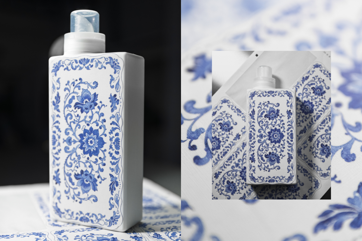
This is our first ever sample of a new print we’re testing as part of exploring beautiful upgraded bottle designs!
We’re thinking about how we can bring amazing patterns and artwork onto our existing bottles - this one is inspired by classic Spode prints and we’re so happy with how it’s turned out! 😍
The texture of the sticker gives a really warm, homely, linen vibe and the print has transferred beautifully onto the material. It’s not the final design as we still need to add all the T+A branding you know and love, but we’d love to know what you think! Would you love to see this, and other artwork on your T+A bottles in 2026? 💙


947 comments
Asma
Just beautiful and timeless! Love blue and white prints so would definitely buy
Catherine Bosworth
Love this 😍💙
Tessa Aston
I’d happily buy one for the fabric cleanser spray. So pretty, clean and fresh. Love it ❤️
Jewel Scott
Love these bottles
Helen Collard
Beautiful. But don’t call it a sticker. I’ve been thinking a lot about your Candy Beach post. I wanted to say to you, look at Dyptique. Your fragrances are just as beautiful. I’ve been a long time fan since my daughter introduced me and I’m now a subscriber. But I always thought your marketing was too young. You’re such a classic brand. Market accordingly. Use words that reflect the gorgeous ingredients and scents you use. It might be a ‘sticker’ but actually it’s just a way of getting your design onto the bottle. You don’t need to mention that – just ‘look at our new bottles’. They are beautiful. Have confidence. I will continue buying xx
Leave a comment
This site is protected by hCaptcha and the hCaptcha Privacy Policy and Terms of Service apply.