What do you reckon? 🥰🩵
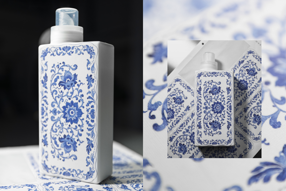
This is our first ever sample of a new print we’re testing as part of exploring beautiful upgraded bottle designs!
We’re thinking about how we can bring amazing patterns and artwork onto our existing bottles - this one is inspired by classic Spode prints and we’re so happy with how it’s turned out! 😍
The texture of the sticker gives a really warm, homely, linen vibe and the print has transferred beautifully onto the material. It’s not the final design as we still need to add all the T+A branding you know and love, but we’d love to know what you think! Would you love to see this, and other artwork on your T+A bottles in 2026? 💙


946 comments
Jan Zutt
Personally I’m not a fan, I prefer the simple/ uncluttered look ~ sorry
Dale
such a great idea. I think Liz Harry’s work would look great on one of these!
Martina
Reminds me my country’s folk ceramics (Modranska from Slovakia). It’s very pretty but a bit overwhelming. Maybe just bottom half of the bottle with flower design and top part left white with blue writing or vice versa would be more gentle to the eye???… 😉
Jayne Walker
Erm tbh I prefer the simple, minimalist, elegant and classy look. I’m not a Chintzy/Spode kinda gal sorry
Helen Baird
This is a genius idea 💖💙🩵
Hopefully lots more to arrive 🤸♀️🤸♀️
Leave a comment
This site is protected by hCaptcha and the hCaptcha Privacy Policy and Terms of Service apply.