What do you reckon? 🥰🩵
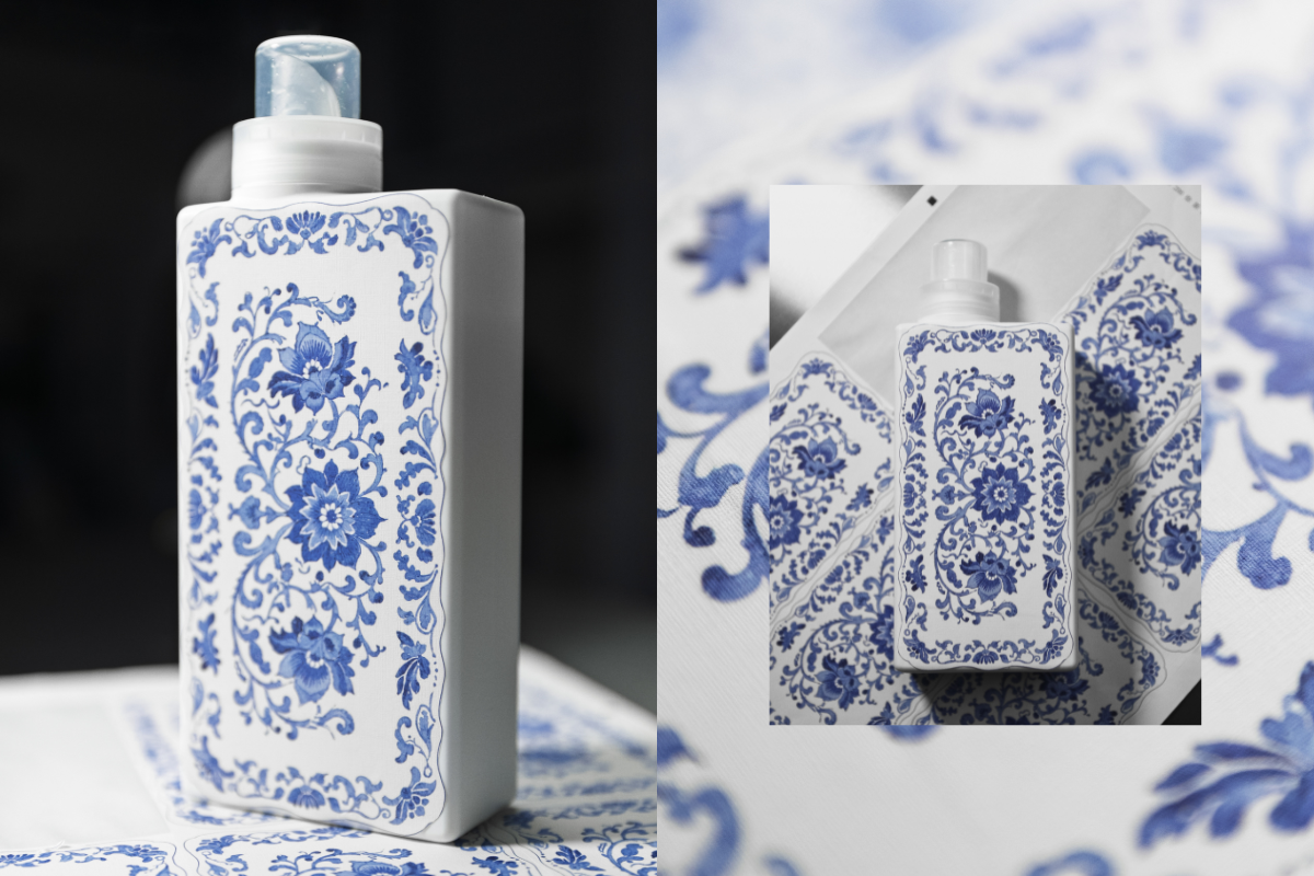
This is our first ever sample of a new print we’re testing as part of exploring beautiful upgraded bottle designs!
We’re thinking about how we can bring amazing patterns and artwork onto our existing bottles - this one is inspired by classic Spode prints and we’re so happy with how it’s turned out! 😍
The texture of the sticker gives a really warm, homely, linen vibe and the print has transferred beautifully onto the material. It’s not the final design as we still need to add all the T+A branding you know and love, but we’d love to know what you think! Would you love to see this, and other artwork on your T+A bottles in 2026? 💙


948 comments
Laura Husher
I don’t love this. I think the original bottles look more stylish and clean, which is more on brand than old fashioned and fussy – just my opinion. I don’t dislike the idea of artist designed limited editions if they are on brand and have a nod to the scent, but I wouldn’t buy your sample example
Ollie Stevens
Shall I just give you all my money now??
Jenny Bohn
I have been a huge fan of your brand,products and amazing customer service since the beginning…..however I don’t agree with taking things this way. Making the bottles look pretty with patterns could make them more appealing to children and people with visual impairment may find it confusing. Think of all the amazing ways chilly water bottles cover their bottles-but we know they are water bottles. By adding this element you could run a huge risk of the product being mistaken for something else. Your products don’t have child safety lids on. Some of the scents could be mistaken for squash flavours. Yes responsible adults keep laundry products out of children’s reach -but kids can get things. Personally it would be better trying to incorporate a child safety lids and braille on the bottles for the visually impaired. I enjoy seeing the colours of my bottles. This is one I think you need to reconsider or adapt slightly-maybe just a side strip with a pattern to match the colour of the bottle. But as a lot of brands now include child safety I feel this should be a higher priority-because all it would take is one mistake and your whole brand could be lost.
Sadie Dodds
I like the idea for a multi scent refill bottle but for the fragrances individually I prefer the block colours. They sit in my cupboard under the sink, I don’t care too much what artwork is on there 😅
Elizabeth Evans
Absolutely beautiful
Leave a comment
This site is protected by hCaptcha and the hCaptcha Privacy Policy and Terms of Service apply.