Here at T+A our main focus is creating the ultimate laundry products for you to use and enjoy. For us to do this we need to keep developing ideas and sharing them with you!
We’ve not been doing enough of this recently so we thought we’d share something we’ve been working on to hopefully accelerate development and keep improving our products! 😍
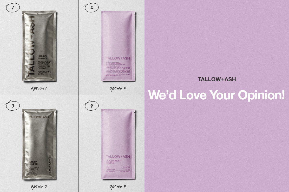
Instead of creating lots of new packaging every time we want your feedback, we’ve started working on one elite sample sachet for us to send when we need your opinion on new fragrance and formulation.
We've got some ideas and we’d LOVE to know what you think and which ones are your fave! 💜

What do you think?! Are you leaning towards the silver or the T+A lilac?
We can’t wait to hear your thoughts and get this packaging up and running and delivered to your door. Leave us a comment on this blog with your favs!
As always your opinion means the world to us and helps us SO much. 🥰
3057 comments
Julie Wright
Option 7 it’s clear what it is and didn’t need to put my glasses on 🤣
Kerrie Hill
Option No.9
The lilac is too close to the released branded products, could be mixed up, and most importantly not inclusive for those with dyslexia/sight imparments ( i need high contrast).
The two tone on option 9 makes it clear it is a sample while keeping it on brand.
The writing could be clearer, but is the clearest while staying on brand.
Suzanne Bowser
I like no 9 with no 10 second
Phyllis
My fave is number 10 but would like the grey writing to be darker which would make it easier for me to read
Sue McAllister
My favourite is Option 1 its bold, striking and you can read the text!!
Leave a comment
This site is protected by hCaptcha and the hCaptcha Privacy Policy and Terms of Service apply.