Here at T+A our main focus is creating the ultimate laundry products for you to use and enjoy. For us to do this we need to keep developing ideas and sharing them with you!
We’ve not been doing enough of this recently so we thought we’d share something we’ve been working on to hopefully accelerate development and keep improving our products! 😍
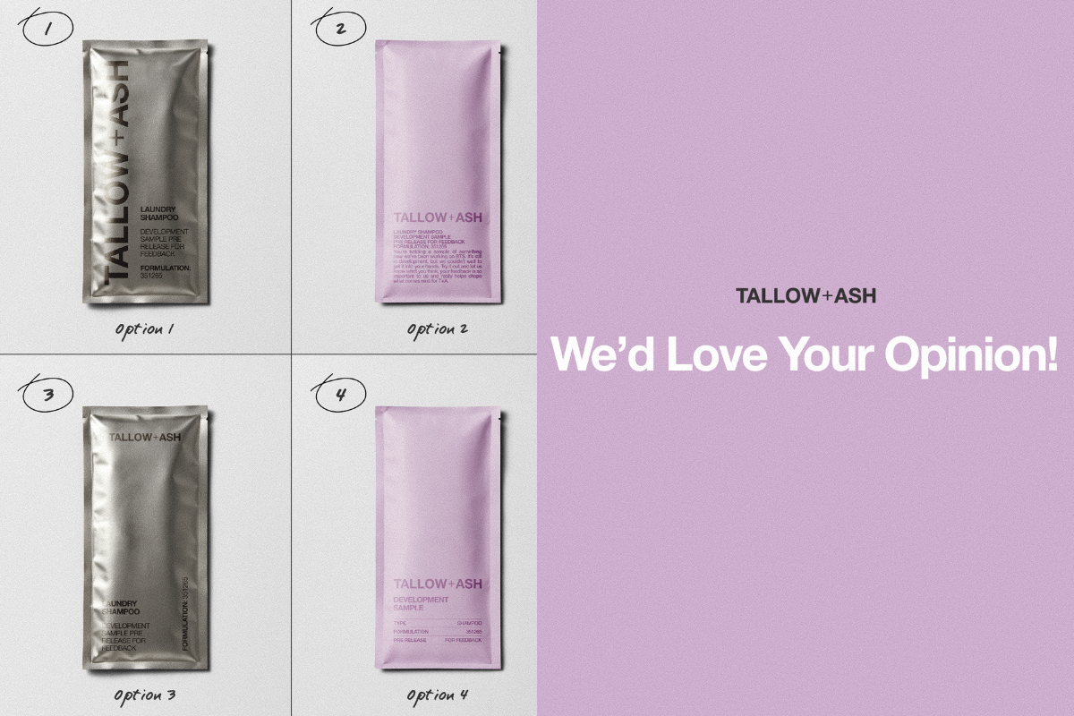
Instead of creating lots of new packaging every time we want your feedback, we’ve started working on one elite sample sachet for us to send when we need your opinion on new fragrance and formulation.
We've got some ideas and we’d LOVE to know what you think and which ones are your fave! 💜

What do you think?! Are you leaning towards the silver or the T+A lilac?
We can’t wait to hear your thoughts and get this packaging up and running and delivered to your door. Leave us a comment on this blog with your favs!
As always your opinion means the world to us and helps us SO much. 🥰
3057 comments
Jenna
Definitely most drawn to option 4 – but I agree with the comment that option 1 in the brand’s lavender colour would have been great!
Gillian Helm
I prefer option 4 😀
Toni Guest
Option 4, I was drawn to that one.
Jane
I like 3. I prefer black lettering as it is easier to read and would be easier to distinguish between shampoo and conditioner when in a hurry, there is not too much information on the front. If I need to read any information I can look on the back and put on my glasses!
I do like the pink, or different colours for different scents but I find the slightly darker lettering difficult to read.
Katie
Definitely 4, its simple, classy and effective and the matte look is easier on the eye. I also prefer the layout. I have adhd and would not be reading all that text for the information I need.
Leave a comment
This site is protected by hCaptcha and the hCaptcha Privacy Policy and Terms of Service apply.