16 June 2026
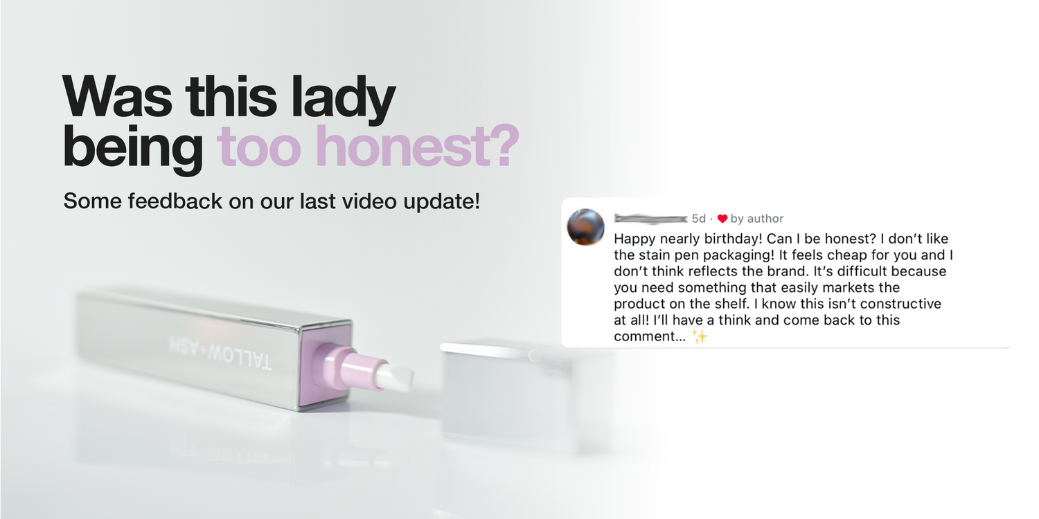
Was this lady being too honest? 🫣🤪😂🫶
We showed our new packaging, thinking it was great, and a customer commented saying that she didn’t like it 😮
But really, that comment was exactly what we needed! Because honestly, we didn’t like it either 😅😂
We are trying to do something different in laundry, to reinvent an entire industry.
And the way that we designed that first packaging was actually to satisfy the way retail is currently done! But it just doesn’t nail what we are trying to do.
So, thank you! 🫶
We are sending you a free stain pen for giving us the push we needed, and we’ve gone back to the drawing board 😂
Here’s a few shots of what we’re working on! I’ve labelled them A, B, and C so let us know which one you prefer, and we’ll make it happen!!


1171 comments
Dawn Merrett
I like A or B if pen is protected but if not then C as it is covered and won’t be marked.
SABRE
I like the current one with the addition of the product name on the top
Sophie Shimell
I like the current one!
Sam Jennings
B or C, but they are all better than the current design. I get that it needs to stand out on the shelf but your current packaging design is a huge part of what makes you stand out so don’t change the style just for supermarkets. I have seen other brands do similar things and it has had a negative impact on them. Once you try a stain pen you will never go back so you just need to get that initial interest!! 🥰
Beth
B is soo nice and obviously cause you see it how it is it – it will show buyers how it really is a take with you anywhere product! Only suggestion is maybe on one of the sides block that up and put the QR code so people can see how great the pen is before they purchase!
Leave a comment
This site is protected by hCaptcha and the hCaptcha Privacy Policy and Terms of Service apply.