What do you reckon? 🥰🩵
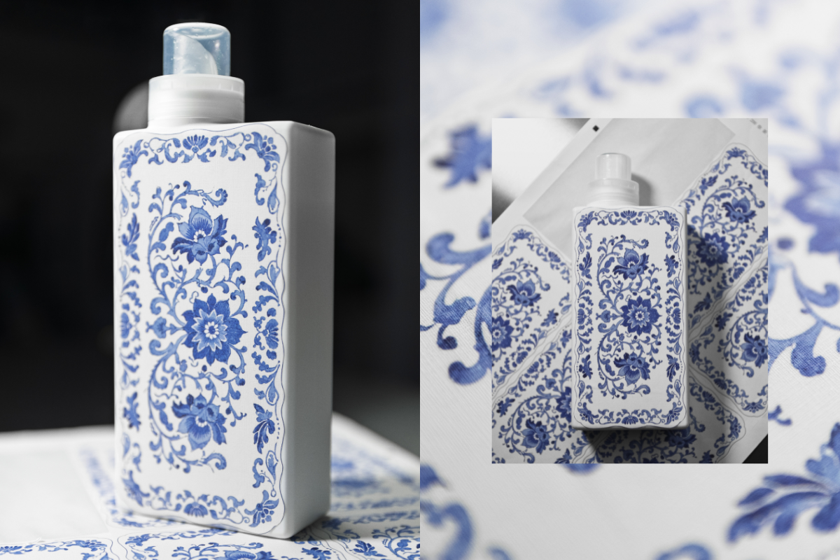
This is our first ever sample of a new print we’re testing as part of exploring beautiful upgraded bottle designs!
We’re thinking about how we can bring amazing patterns and artwork onto our existing bottles - this one is inspired by classic Spode prints and we’re so happy with how it’s turned out! 😍
The texture of the sticker gives a really warm, homely, linen vibe and the print has transferred beautifully onto the material. It’s not the final design as we still need to add all the T+A branding you know and love, but we’d love to know what you think! Would you love to see this, and other artwork on your T+A bottles in 2026? 💙


964 comments
Mary Driver
Its a beautiful design & as you mentioned very Spode. Id love to see the full design on the front of the bottle, Tallow & Ash naming on one or two sides and then all the other details that are essential to using the product on the back. Maybe print the Fragrance right at the top of the front. Just my opinion 🫠 but think the overall design you have is so beautiful ❤️
Kerry Chestney
It’s nice, but its a no from me. Simplicity is best. Love the plain colours instantly recognisable and chic. If it ain’t broke don’t fix it. Imo
Julie Turner
Love the design, so fresh and crisp.
Ricky K
You’re losing the magic of your brand by ultimately copying historic, artistic imagery. Stick to your eye catching, original and awesome style T+A …. Less is more!! 💯🙌🤩👌
FIONA
It’s pretty enough, but I actually prefer the existing packaging. I don’t spend time gazing at my detergent bottles!
Leave a comment
This site is protected by hCaptcha and the hCaptcha Privacy Policy and Terms of Service apply.