What do you reckon? 🥰🩵
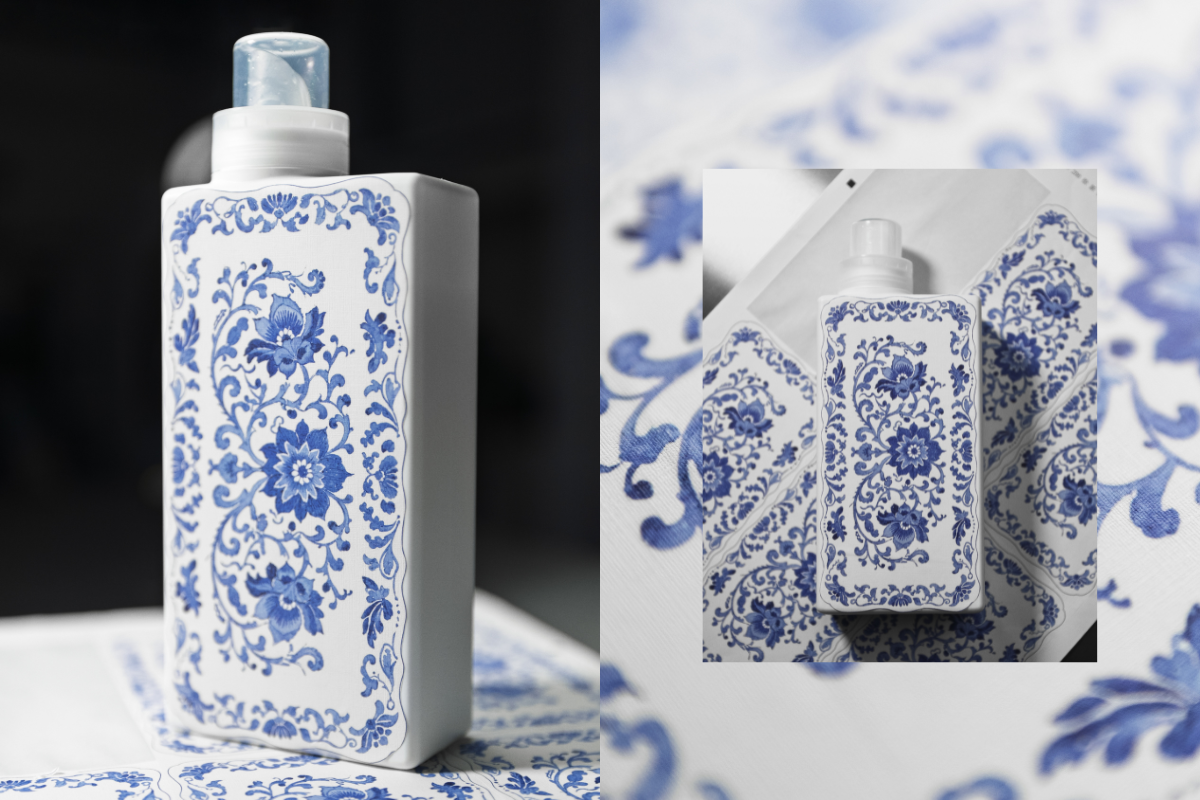
This is our first ever sample of a new print we’re testing as part of exploring beautiful upgraded bottle designs!
We’re thinking about how we can bring amazing patterns and artwork onto our existing bottles - this one is inspired by classic Spode prints and we’re so happy with how it’s turned out! 😍
The texture of the sticker gives a really warm, homely, linen vibe and the print has transferred beautifully onto the material. It’s not the final design as we still need to add all the T+A branding you know and love, but we’d love to know what you think! Would you love to see this, and other artwork on your T+A bottles in 2026? 💙


964 comments
Lynsey
Prefer the current design – this looks too fussy!
Deborah Warner
Not my thing, I like the colours you have, that patter is very busy. Maybe a picture that goes with the fragrance. Maybe get your customers to come up with some ideas, and send them into you. But I love all that i have purchased so far. Well done.
Farah Ali
Simply beautifulx
Jake
A nice concept, and a bold pitch to offer something so different to the iconic block colours they are synonymous with the brand! Does seem quite polarising though – how could this be brought to life while maintaining the brand identity? Maybe cardboard sleeves for limited edition bottles could carry designs like this, creating a clear after use as frameable artwork – with the bottle colour remaing block colour, complimenting the design on the cardboard sleeve..
Evelyn Anderson
As nice as it is, if this has an impact on the prices then it’s a no from me as i think your products are costly, especially with a family. Regular washing stuff lasts much longer than yours. That’s not to say i don’t like your products but I buy every now and again or when there’s a discounted offer. If the cost of the products could be lowered even better
Leave a comment
This site is protected by hCaptcha and the hCaptcha Privacy Policy and Terms of Service apply.