What do you reckon? 🥰🩵
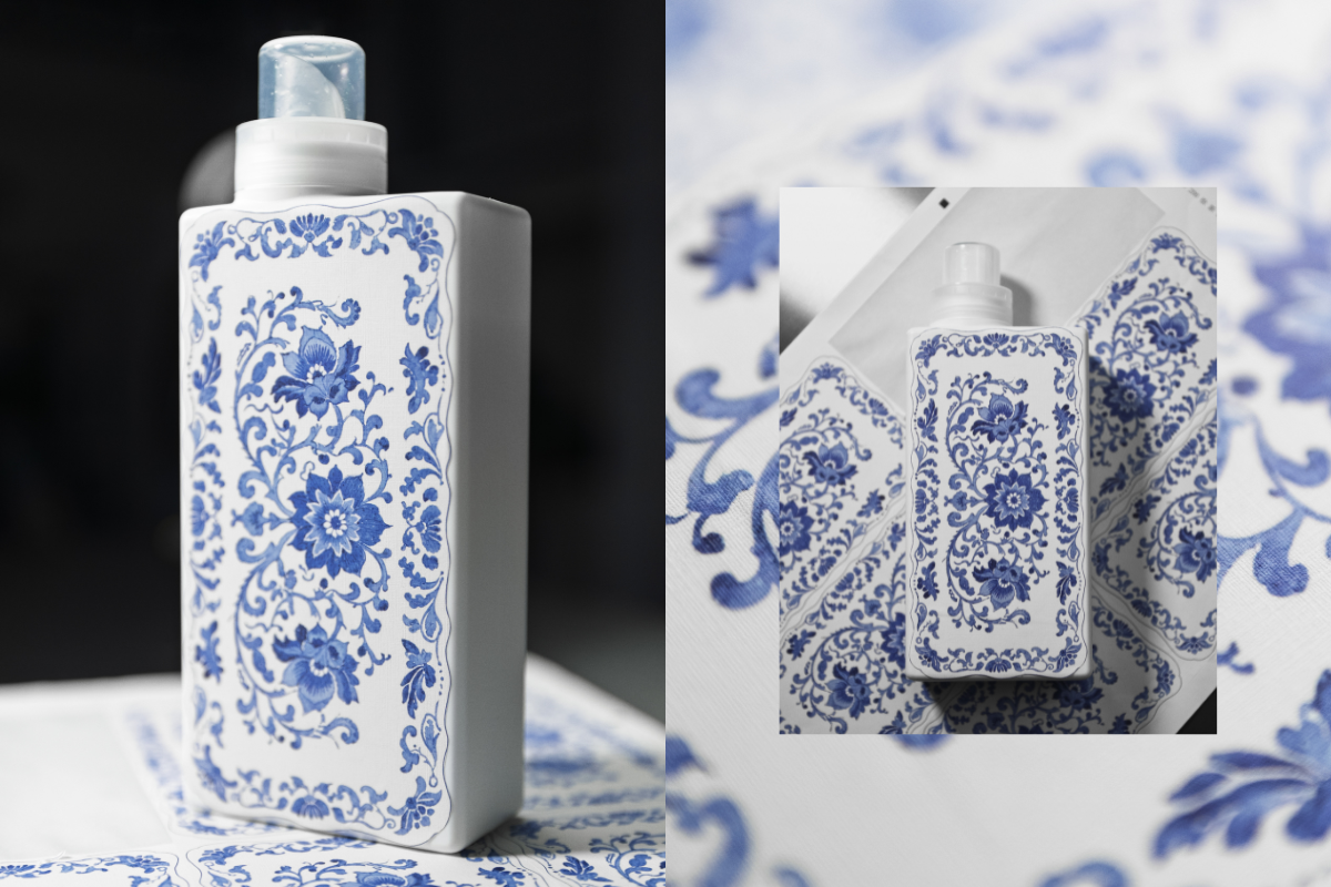
This is our first ever sample of a new print we’re testing as part of exploring beautiful upgraded bottle designs!
We’re thinking about how we can bring amazing patterns and artwork onto our existing bottles - this one is inspired by classic Spode prints and we’re so happy with how it’s turned out! 😍
The texture of the sticker gives a really warm, homely, linen vibe and the print has transferred beautifully onto the material. It’s not the final design as we still need to add all the T+A branding you know and love, but we’d love to know what you think! Would you love to see this, and other artwork on your T+A bottles in 2026? 💙


964 comments
Rosie Hamer
Personally not to my taste, i really like the minimalist block colour bottles you have now. They are bold and eye-catching as they are, i think a pattern like this one is a little too much and less likely to fit in with themed kitchens, also maybe aimed a little more at the more mature buyer.
Phoebe
I think the print is pretty but I prefer them as they are. I like how minimalist and chic they currently are.
Sarah Dobson
I love this
Di
ABSOLUTELY BEAUTIFUL 🤩 Can’t wait for this 💙
Georgia
What a lovely way to reduce platic waste! We go through our fragrances one at a time. This would allow us to have a beautiful neutral bottle, which would accommodate the fragrance we are currently using – then we could just use different refills to enjoy a new scent every time the gorgeous botlles get empty! 💗
Leave a comment
This site is protected by hCaptcha and the hCaptcha Privacy Policy and Terms of Service apply.